


 Menu
Menu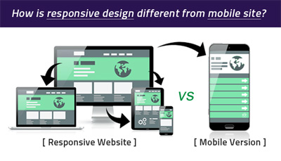


A responsive website and a mobile site differ in the way they provide users the reading experience. In a mobile site, the server optimizes the page to be given to the user while in a responsive style, the device by itself adjusts the site according to the device properties.
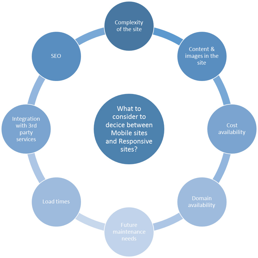
Creating different domains in a mobile site can impact the organic search traffic while having a single url & one’s own domain, not having to go through any complex redirects is a merit with respect to responsive sites!
Mobile sites using different domains from that of the desktop site do not count as the search link equity in view of the main site whereas the simply embedded new code at the backend for a responsive site preserves the link equity! This is a great thing to note in difference between mobile site and responsive site because it clearly distinguishes how better a responsive site in terms of search is! SEO is not affected for responsive sites while it is a constraint for the mobile sites!
Mobile sites may require quite a lot of maintenance as different mobile devices keep coming up quite often whereas it’s just a single time effort/time/expense in development of a responsive website design!
When it comes to complaints on a mobile site, they are known to exclude some content/functionality which are more relevant to users, sometimes due to the server adjustments that go on whereas responsive websites handle it beautifully providing content for any version of the website anywhere.
In terms of cost, it is known that responsive sites are expensive but it’s quite obvious things with better results do cost some extra time/effort/expense?! But it’s worth mentioning here optimization of responsive sites to make them give a better performance is important otherwise they may tend to fall out on load times! Google Pagespeed Insights once quoted loading speed is a huge factor to be considered in responsive designs where they may have to be a balance to be maintained between the user experience and load speed factor.
Integration with existing or new 3rd party services might be difficult with a responsive site while it is easier with a mobile site due to the availability of different domains!
For sites not including a lot of text or images, mobile site may be better compared to the responsive site! Smaller less complex sites work great with mobile sites that have lesser web pages to be maintained and with simple web addresses. Larger, complex sites with a lot of content and media files work well with responsive sites while they may require an automatic redirection script and the relevant effort to design it!
Do you stand flabbergasted by the pros and cons of both responsive website and mobile site and just stuck as to what’s for the website development in your company/for your estore? No worries; ask us for the apt and timely assistance at considerable expenses for anything in web/ mobile, non-responsive to responsive especially; at QeHTML, you are ensured just the best!
