


 Menu
Menu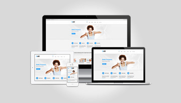


hat is right! If you are happy, you would respond to everybody! If you are not, you would simply go into a shell and shun the world. Websites are pretty much the same. A well crafted website that is uniform and compatible with various devices works wonders in increasing visitor traffic.
More than half the population across the globe is now using smartphones. The basic expectation is that any website that is accessible on a desktop or a laptop should open and be legible on their handheld devices as well. Easy accessibility is the game winner!
Here are a few of the salient features to keep in mind:
Is the website compatible with all kind of screen sizes and resolutions
If website the is legible on a phone, then it should also be legible on a tablet as well.
Is the menu properly accessible; menu and other links should open in an organized manner
Banners and pictures don’t break or haze out
The header and footer section should fit the screen size and resolution.
These are some of the important factors that often get ignored. It is not just about managing to push your website into the device screen size and resolutions. The website should be fluid and easy to access and the CSS shouldn’t get stuck while accessing the internal pages of the website.
Responsive designs and templates are in trend right now. Nowadays rarely would you come across a website that is not responsive. Responsive means being accessible and legible while maintaining the structure no matter what the screen size or resolution. If you don’t have a responsive website, your business will suffer as it won’t be cater to all the visitors. Web designs laden with heavy graphics and animation can be resource consuming and can fail to open on the phone screens and so having a responsive design saves the day!
