


 Menu
Menu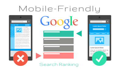


Of all the ranking factors of Google, site responsive occupies one of the top positions; Responsive web designs/ mobile friendly websites are at a higher attraction for the Google algorithm. This means websites should have their mobile search optimised if they are intending to come up in the 1st 2 pages of SERPs. This again connects to the user satisfaction in getting the best quality results from search in any device thereby user friendly websites are obviously at a better position compared to the rest. In crux, business growth simply depends on an ideal web design sufficing the customer needs.
“Mobilegeddon” shouldn’t be a term you are ignorant about, any more. It’s just the other name for Google’s mobile friendly algorithm that has come up since a year boosting the mobile-friendly/ all device compatible websites in search results. This is highly dominating the SEO future and of the digital marketing as a whole!
Let’s take a look at 3 different similar-sounding terms in the context,
Google is kind enough to mention the the merits and demerits of each of them @ SEO guide, responsive design guide and in a few other web master pages; of all the ones it’s the responsive design that’s highly recommended. High quality content without duplication, design supporting the crawl efficiency without having to index multiple site versions are some of the features of a responsive site and this design forms a highly required SEO factor.
Why responsiveness is a ranking choice? Check the facts below!
If you are on a look out for the best ranked website in Google search, in desktops or mobiles or any other device and target to get the highest possible traffic & conversions, we don’t see a reason you wait going responsive! Contact us at QeHTML for the best in non responsive to responsive site conversion!
