Responsive web design, mobile friendly website, user friendly website, all device compatible websites have become the need of the hour for an ecommerce website development to combat the needs of the customers who have grown in numbers in using the smart phones or hand held devices. CSS3 comes alongside of HTML5 so you make a responsive website using media queries.
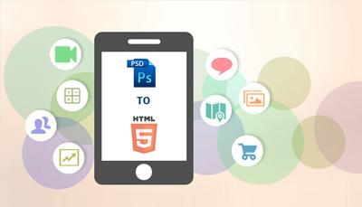
For beginners who are just getting to work on web design using HTML5 and CSS3, a few step guidelines on PSD to HTML5 conversion will add a lot of value we believe. Read on for the steps,
- PSD design: To start with, it’s important you have a good PSD file. Make sure you have a sufficient understanding of the venture only when you can come out with the best PSD using the necessary header, footer, navigation, sidebar and all placed appropriately. Also make sure the design is made in layers of Photoshop so that you use the right things at the right place with the help of the slice tool
- Colors: Colors though come under a part of the PSD design; they require a special attention because they form one of the prime elements behind the success of a website. Color preferences differ even between the 2 two genders. Make sure to select the right colors for your website grasping the theory of colors.
- HTML5: W3C recommended HTML5 has eased the web design process; images are no more a necessity for a good looking website, CSS3 & HTML5 do a better job for the CTA (Call To Action) rather than an image doing it. An increased load speed is possible due to avoiding high resolution images & flash based videos but don’t miss if you definitely need to use certain images. Make sure you know fully about HTML5 to get the best out of it.
- CSS3: Website redesigning with lesser codes has been made beautifully possible with the CSS3 raised out of HTML5. Selectors and properties available, 2D/3D transformation choices, gradient, 360 degree transition, border image for border creation, text shadow, and so have made the designing so good for an estore today.
- Media queries: Media queries to convert a site into a responsive one comes with CSS3. The media dependent style sheets are created to accommodate different media types, as in width, color, height which helps the website easily adjust to the size of the screen of the device in which the site is used.
Knowing the PSD to HTML5 doesn’t end here but definitely requires the expertise and experience to use all of these in an appropriate manner in the right context for the right site. If you require any assistance in using them or require a complete web design converting PSD to HTML5 or making responsive websites or any ecommerce service, feel free to give us a shout!


 Menu
Menu