web development

The pyschology of colors and website conversions

How colours persuade one to buy has always remained an interesting topic of discussion in marketing. The discussion has never drawn to a close rather stays open with respect to the depth of analysis required. Colour psychology is the science of colours, a part of behavioural science, defining how it impacts the human nature, the nature of buy in ecommerce. Out of the 90 seconds a viewer takes to decide on a product, more than 60% of the thought goes on/by the colours in website!

One needs to understand where to use the colours and how when planning on Redesign websites or on web design. Colour scheme includes the colours used in graphics/images/media files, those used in headline, those in header/footer, those in boundaries and those in links/buttons.

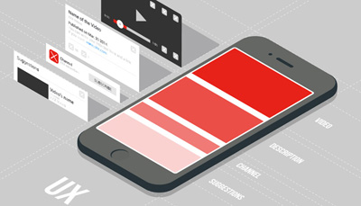
Understanding the perfect usage of colours is quite tricky; using them at the right time in the right context to the right audience is definitely a challenging art. Different colours have different impacts on the viewers. Light orange shows optimism/clarity/warmth, dark orange shows friendliness/cheer/charm, red shows dominance/courage, purple shows imagination/shrewdness, green shows peace & health, light grey shows calmness/mildness and sky blue shows trust/depend-able nature,. So now you know how stupid is using a black based website for selling products for kids like games/toys! Effort put in making a good decision on colours in web development has a great way to lead conversions.

5 common divisions of trait, sincerity, excitement, competence, sophistication and ruggedness directly relate to the colours sky blue, dark pink, light green, purple and sandal respectively. Though brands cross between 2 traits, dominance is towards a single colour. The personality your website portrays depends to a big extent on colours in the latest human view, which needn’t be the stereotype view of green means earth/environment! If you think of Skype, Facebook, LinkedIn and Twitter having blue in common, that’s because all of them are social media sites where the same blue conveys innovation in Skype, calmness in Twitter, trust in Facebook, professionalism in LinkedIn, stability in WordPress and creativity in Pandora.

How do you do the exact mapping of colours to conversions? Keep in mind,

  • Women are allured towards purple, blue and green but don’t turn towards brown/grey; not always they love pink;
  • Men love green, black and blue that emulate a manly emotion;
  • Call To Action buttons are great in green giving a ‘go’ signal to the users.
  • Want to show luxury? Would you think of anything else than black, for its entire majestic and grand look defining sophistication? To an extent, dark purple adds to this section.
  • Freedom, flexibility, spaciousness are best shown in white!
  • Very well known is the fact that blue is the best for media or in making connections!

Awareness is bringing potential visitors to the site turning them into customers. Having the colour psychology in mind got aware in this blog or even via other channels, you concentrate on giving the right colour to the website in various sections, you can be sure you are on the most sensible path to increase web conversions. Should you require assistance here or in the web design completely, don’t wait to ask us at QeHTML!

Golden rules for designing mobile UX

Discussions at the level of world summit puts forth the below in short on UX design guidelines: Striving for consistency, catering to all customer usability, offering clear details, clear call to closure, error-free site, making reversal possible for any action, & reducing memory load.

Another book on rules of web design states placing users in control, reducing the memory load and making the design consistent for users as the rules for design of user interface.

In the world of smart phone domination today, website redesigning or website creation must take responsive web design/ mobile friendly website/ user friendly website/ all device compatible website into consideration in order to provide the best mobile UX.

To mention the results consolidated yet in a detailed manner especially for mobile user interface experience, the below 10 provide the content,

  • The design to ensure task-oriented flow and user-centred procedure
  • There requires a good amount of effort in adding a meaning and value to the UX in any web design
  • Leniency to be given to the users to an extent
  • Smaller screens to be used as much as possible so that the user doesn’t have to pinch/zoom to get a clear view of the site
  • Standard patterns to be leveraged. User task to be conveyed clearly, consistency across products is necessary, user interaction to be inform, aesthetic appeal, giving an exploration possibility to the users come under giving a standard interface.
  • Gesture intensive designs, as in, swipe, pinch, or tap are essential to make the mobile designs at the best. Type of action, action location on the screen, and the user ease to access them are the details to be contained in the gesture incorporation
  • Smart motion design which is an attempt to create a visual make of the website synthesizing all principles of a great design with all the possible innovations in science and technology
  • Clear communication in the design; the images and content to depict what you offer and what the user gets from you. A picture is more powerful than the words; images go to a long term memory and the words sit in a short term memory in us; the best visuals to be contained
  • Making sure to invest as ideal as possible on the first time user experience. This is the most important to be taken care, making note of showing the web sections in a cool manner, giving neat & clean directions and making things quick for the user
  • Making sure not to force registrations; allowing guest check outs and rewarding for account creations.

While some of the above rules may sound complex, it all lies in a simple expertise of design principles to achieve them. If you are looking out for non-responsive to responsive conversion services or redesigning mobile UX or perform the web design entirely, ask us at QeHTML for the best experience!

Why your website is the most essential business tool?

Why your website is the most essential business tool?

Irrespective of the size of the business, a website is a must; it’s the most indispensible business tool a business cannot avoid having. Coming to how it should be, it’s just not enough with a good look but has a long way to go in terms of the content, content management, navigation, communication window, responsiveness and a lot more. When the internet bloomed 2 decades above, a website sat on basic html, text and a few images; since then it has gone through various developments till today where the internet and technology drives the need of responsive websites owing to the growing use of smart phones/tablets.

How should be a website so it serves as the best outface of the business?

  • Mobile friendly websites refers to a website that looks the best on hand held devices as well, having the right size of single column, navigation-friendly and basic yet effective design. Don’t be surprised to know they are the most favourites for the Google algorithm! Mobile optimized websites are exclusively designed for phones and may mostly redirect you to the desktop version due to the inability to accommodate a lot of features. Responsive web designs/mobile-responsive sites are the best of the above where the site restructures itself to the size and resolution of the device; these are the ones picked up by the search engines!
  • Content and management: It’s with the content people engage in your website. Having the most relevant content, in simple terms, just to the context yet effective and having it regularly updated by way of content management systems is a big criteria for the search engines recognize you
  • Landing pages: Landing page design is one of the most important aspects in website development. They should relate at the best to what your website intends to convey, with the right text, content, images, videos, graphics, to the intended audience and navigation!
  • Customer-centric: Creating a customer centric design is necessary rather than just trying to sell who you are. Make sure your website conveys what you can do for the users
  • SEO: The websites being search engine optimised is yet another necessary design aspect of the web design and drives what your website ranks in SERPs. Having a prominent search button is required; it is the combination of these both that pushes your site to the top most result page. Don’t be shocked to know more than 90% of the users don’t even go to the page 2 of results!
  • Clear strategy and brand-driven: Having a great marketing strategy requires defining feasible long term and short term goals, web designer knowing how to bring them in, and most importantly to convey them in a manner every user can interpret which is very crucial to generate traffic
  • Online marketing: Web marketing like Google Adwords highly target online advertising so the searchers are directly taken to your website. Make sure to have this optimised if not yet done!
  • Call To Action: Directing the users straight and distinctly to the CTA buttons is required so the users get to know how to ask for your services/products.
  • Website redesigning is necessary simply because trends keep changing, user expectations keep rising (is there anything more you need for the reasons to redesign?!) and it’s quite obvious you need to keep in par with the customer needs in terms of how the website looks and what it conveys. Html5/CSS for coding, content management using WordPress, Drupal, Joomla, are all some of the basics to be taken care; if you are missing out on them, be alarmed it’s high time you do the redesign.

While you do the best of offline marketing and other forms of business communication, make sure you don’t miss out on having a website which is the inevitable business tool towards the business growth. If you are on a look out for assistance in any of these or more in ecommerce services like responsive conversion, website redesign or more, do contact us at QeHTML!

Crucial connection between SEO and User Experience UX Design

Search algorithms of Google are intended to give the best possible results to the users; the huge amount of rolling and revolving around the SERP rules that they do are all made upon thinking in the user stand point. Everything that’s written has to have the best link with the users if not for whom are they written! Should SEO (search engine optimization) and UX be linked in website development has always been a debate but needless to say it is ‘yes’ that wins!

SEO determines if a site ranks among the search engine result pages and UX defines if the users hitting the search are getting the best quality results. If the content scrutinized for top pages by the search engines is great then quite obviously the users are going to get excellent results in the first 1-2 pages of search results. There might a few instances when they don’t go hand in hand but for sure there’s a huge connect between them.

How can top UX methods indirectly benefit for the SEO?

  • Navigation ease: Navigations and XML sitemaps when taken an utmost care for both UX and SEO, we end up getting the direct and indirect benefits of SEO. Proper indexing and easy spot by bots is made sure by site maps and this of course adds to the UX. Site maps also transform the website easier to follow such that users can reach any web page within 4 clicks or even lesser and this is a great ease for the users to get to where they want; and Google indexes the content easily as well.
  • Relevant content: Content for UX has to suffice the requirement of what Google sees as a relevant content. 3 main aspects of a quality content Google quotes are here below,

    — Time metrics: Google has metrics to check if the user that clicks on a result stays there or hits the back; this shows if the content is engaging the user or not.
    — Panda updates: Human evaluations along with algorithmic evaluations are taken up in Panda updates so as to ascertain the user need out of a quality site. Make sure your site suffices most of the Panda requirements
    — Links: Strong link connections to and from authoritative sites sharing the same details as your site does are taken up as strong signals of a quality website, by Google. Make sure you do the best link building

  • Responsive design: Mobile optimization is a major SEO aspect today which is considered one of the mandate requirements of Google ranking criteria as well. Making responsive websites that fit great on a desktop as well as on a hand held device is no more a luxury but a necessity.

A content that’s great in quality, earning UX benefits indirectly is that which is going to give the combined SEO and UX success. Looking for such an expertise web designer to optimize your website/face lift in all the ecommerce aspects, feel free to reach out to us!

Things to know about PSD to HTML5

Things to know about PSD to HTML5

Responsive web design, mobile friendly website, user friendly website, all device compatible websites have become the need of the hour for an ecommerce website development to combat the needs of the customers who have grown in numbers in using the smart phones or hand held devices. CSS3 comes alongside of HTML5 so you make a responsive website using media queries.

For beginners who are just getting to work on web design using HTML5 and CSS3, a few step guidelines on PSD to HTML5 conversion will add a lot of value we believe. Read on for the steps,

  • PSD design: To start with, it’s important you have a good PSD file. Make sure you have a sufficient understanding of the venture only when you can come out with the best PSD using the necessary header, footer, navigation, sidebar and all placed appropriately. Also make sure the design is made in layers of Photoshop so that you use the right things at the right place with the help of the slice tool
  • Colors: Colors though come under a part of the PSD design; they require a special attention because they form one of the prime elements behind the success of a website. Color preferences differ even between the 2 two genders. Make sure to select the right colors for your website grasping the theory of colors.
  • HTML5: W3C recommended HTML5 has eased the web design process; images are no more a necessity for a good looking website, CSS3 & HTML5 do a better job for the CTA (Call To Action) rather than an image doing it. An increased load speed is possible due to avoiding high resolution images & flash based videos but don’t miss if you definitely need to use certain images. Make sure you know fully about HTML5 to get the best out of it.
  • CSS3: Website redesigning with lesser codes has been made beautifully possible with the CSS3 raised out of HTML5. Selectors and properties available, 2D/3D transformation choices, gradient, 360 degree transition, border image for border creation, text shadow, and so have made the designing so good for an estore today.
  • Media queries: Media queries to convert a site into a responsive one comes with CSS3. The media dependent style sheets are created to accommodate different media types, as in width, color, height which helps the website easily adjust to the size of the screen of the device in which the site is used.
  • Knowing the PSD to HTML5 doesn’t end here but definitely requires the expertise and experience to use all of these in an appropriate manner in the right context for the right site. If you require any assistance in using them or require a complete web design converting PSD to HTML5 or making responsive websites or any ecommerce service, feel free to give us a shout!

8 Biggest SEO Mistakes to avoid

8 Biggest SEO Mistakes to avoid

Growth from a SEO novice to an SEO pro isn’t quite easy and does take a few years; keeping in mind the rules of SEO are continuously getting modified. What are some common mistakes that you are prone to do and you should be avoiding?

  • Same strategies don’t work every time: Using the same method might just not work one fine time; this doesn’t mean we keep checking on it, but then it’s better we find something new. SEO is an investment that requires a constant update/change/monitoring and is not a one-time cost; if of course gives the best at the end of its perfect implementation. Keeping in pace with the growing digital system, investing in the right analytics and following the changing SERP guidelines is necessary!
  • Denial does help: Taking up the responsibility of faults is different but then when you know better on SEO guidelines and objectives on what needs to be fixed or what is okay as it is, ensuring a proper data analysis is carried out to investigate what’s broken is important!
  • Focused efforts needed: Just investing efforts in page ranking based on easy SEO keywords isn’t enough if you are targeting good revenue. The right amount of effort is required in choosing the right keywords that yield a bigger return. Not just that, grooming the social media profile, backlink, sharing option, images, product descriptions, security, the responsiveness of the site and all related matter!
  • Tweak the contract if needed: In view of giving the best services delivered to the customer, the SEO agreements mentioned in the contract may need to be overridden to get them fit the site needs. At the same time, it might be even required to work on certain aspects of SEO when it is not mentioned in the contract, if it is requested by the client. Be sure to accommodate!
  • Don’t wait to ask! If the SEO tactics implemented doesn’t yield the required results then it just means we are lacking somewhere. Sticking to same old concepts without having an idea of why it is failing is just foolish. If you don’t see your pages ranking in SEP page rank, don’t wait to ask for help!
  • Shortcuts are just okay: Over optimizing might lead to unnecessary penalties. Flooding the code with keywords, using illegal back links or any other attempt is carried out that is not genuine, it finally goes futile. Watch out!
  • Search engines see buying backlinks as a rule violation or spamming for an obvious reason; if search engines rank a site high and that site has useless back links and unrelated information, the search engine goes bad in views!
  • Make sure you don’t insert keywords just for the sake of search engines when they don’t really fit into the context. Long keywords very specific to the context yield conversions.
  • Tricking search engines just puts you in the trap. Don’t do it!
  • Don’t take the clients light: Securing current clients costs less and leads to getting new ones when you make the current ones happy. Preserve the existing clients; do the needful!
  • Don’t cease to learn: Search engine rules and SEO techniques are subject to continuous changes. Keep up to date in knowing them. Never stop to check upon them or to do the required learning!

Knowing the SEO tactics in website development/ web design for better web page speeds, using the right SEO keywords and SEO Description, content and image optimizing, using the right backlinks, using responsive web designs, you certainly require an expert help to get these implemented rightly. If you are looking for one, give us a shout!

Why to approach QeHtml for Magento Web Development?

A dynamic content management system is very much indispensable, targeting maximize conversions in eCommerce today, where the trends and user expectations keep changing. Not just that, responsive websites, ecommerce checkout practices, featured suitable CMS are all absolutely necessary in design of ecommerce portals if the ecommerce solutions designed are built in an intent to provide the maximum benefits to eRetailers.

Magento, the CMS based on PHP and MySQL is compatible with Linux and requires no investment in licenses. It’s a rich ecommerce platform enabling one to have a good control over the look, content and functionality over the estore helping to reduce abandonment practices. Magento developers bring up a website compatible with desktops, laptops, tablets and Smartphones. Magento’s is highly allured in the shopping cart platforms amidst the other ecommerce technologies due to its reliability, functionality, scalability, constant maintenance by its agile supporters and above all the affordability this open source platform provides.

To mention on why to consult a magento web development company,

  • Techie expertise gives the best: Everything from design to core development is handled at the best by magento developers, which doesn’t necessitate your proficiency in it. Project requirement to be thoroughly understood and to be sensibly converted from vague requirements into business intents to make a flourishing estore; this is possible just by a magento developer.
  • Risk elimination: Market research, competitor scanning and implementing the best practices to produce the outstanding feasible ecommerce solution targeting a high productivity is possible just by Magento developers.
  • Expert solutions: Ethics of growing businesses and an efficient working process/procedure that’s kept up by an expert solution designer provides the most recognized user experience meeting the client requirements quite ideally.

To talk about the dimensions of magento, currently around 1.3 lac websites are using magento; in terms of credibility it is the first and foremost choice of top most online retailers. The aspects of layout file control, model rewrite system and blocks inserted via layout make it exclusive in ecommerce.

Professional magento web design service providers, who would consider all of its features effectively and who are backed up by the magento team guiding with their hands on in diverse projects, alone can give you a flawless magento website that gives the business a flourished web presence and the best ROI gaining you the benefits from both pc and hand held users. If you are on a look out for such a professional magento web designer, just ring us up.

Is your website losing attention?

The website is a revelation of one’s business, brand, motive and customer reach. A visitor turning into a customer for the products and services you sell totally gets decided at the first time the site is visited. Homepage is the greetings which is either going to be successful in retaining the visitor or distract him towards other websites. When you come across the situation where you see the users aren’t sticking long to your website once they access the homepage, you’re sure you’re losing the traffic. Know why!

  • Clutter: Where the homepage is flooded with too much of information, the user doesn’t intend to check many of them and tends to go away.
  • Basic HTML designs: When businesses don’t want to employ someone demanding a good sum and goes ahead with basic html designs, it might sometimes end up in very basic design involving regular text on a basic interface which makes the user suspicious on the ability of the business to deliver complex services.
  • Language blunders: There are some basics which we can never miss to ignore whatsoever be the standard of the deliverables we give functionally. If the products and services you do are just too great but then the website has even a few errors in language basics as in grammar or spelling, it doesn’t give a good view of the business. Authenticity of you is shown here, don’t be careless!
  • Stock Images beyond limits: Only when in high end urgent situations like an article going live much earlier to the planned time or so, one can go ahead with the available photographs. Otherwise mediocre photographs never work.
  • Sound from auto playing flash or videos: Ads throwing their flash video widget content right on the users face or urls playing music at the background isn’t any pleasing to the people these days. They tend to miss the valuable service/product you provide. Regular Java and HTML in a simple interface works the best.
  • No contact details: Make it easy for users to reach out to you. Make sure to provide company’s email address and contact numbers. When it‘s just the mail address, it is quite annoying for some users to wait till the response is received even for simple tasks that take a min or two over the phone. Make sure to have an alluring Contact Us page.
  • Ads aren’t always exciting: Ads are ought to be given a thought as how important they are for the business revenue. Video ads in every page or a colourful banner in corners of the web pages might be your thought but be aware it distracts the users who find the interface too technical. Make sure to retain the average users before you try out these.

Having said these which aren’t any rules for you to stick onto but which have been identified as some of the major causes for declining number of users on a website, if you are looking out for the best web design service provider in web development to create the responsive web designs for your site or implement CMS like joomla to give a great design using images, CSS or so just ask us.

Will responsive web design help increase my product’s sales?

The revolution of mobiles today has resulted in a prediction that by 2018 the number of mobile connected devices would even exceed the world’s population. In this scenario, there isn’t any surprise as to why there’s so much of a stress upon having responsive Websites in web development for an estore or an ecommerce platform.

Responsive websites not just give a great experience to the users but save the time and revenue of the businesses that needn’t have to build separate sites for pcs and mobiles. They add a value to the SEO campaigns due to the simplicity of a single url in place. Above all, Google’s love is the business necessity. Isn’t it? Responsive web designs are one among!

To talk on some figures how responsive websites add to conversion rates, there’s a firm that gives us the data 3 weeks after switching onto the responsive design,

  • Conversions soar by 65.7%, transactions by 112.5%, and revenue by 101.25% for iOS devices
  • Conversions soar by 407.32%, transactions by 333.33%, and revenue by 101.25% for iOS devices

To mention on why responsive websites have created this impact, there are quite a few yet worthy standpoints.

  • User experience: Content sharing is the core of communication between the business and the user via the websites. Responsive websites achieve this at the best. Browsing across multiple devices gives the same great experience as in one device or in a desktop, with responsive sites; no pinching, no zooming, no struggling. Bounce rates might decrease when people find the same content in 2 different views. But then a functional and accessible alternative on any device they use, impresses them to stick onto the website.
  • Audience reach: More than 50% of the population owns a smart phone in united states. What is being used them in the phone is important to understand what can give way to better conversions. Most people (67%) most of the times staring at the mobile for calls or texts even though there isn’t any vibration or tone simply makes it clear of their addiction to the devices. Isn’t this telling you why your website should be mobile friendly, as good as it is on a pc?
  • Good clarity in mails: Talking about emails, KISSmetrics conveys that 90% of the people tend to immediately delete an email if they get to see it in their mobiles, from a business website they aren’t bothered of. The reason for this is the clarity of the mails in a hand held device, click rates thus go down as compared to that in a laptop. Clarity along with good landing page experience for users is absolutely necessary if you wish to grab a million minds. An unappealing landing page leads to lower conversion rates for sure.

If you have woken up for the responsive design trend that’s necessary for every e-commerce platform that tends to cause a big effect on people, and if looking out for the best service provider to implement responsive websites, wordpress, joomla, psd, CMS, drupal or any for sales and business growth, just ask us. We assure you just the best.

Is your non-mobile friendly website the reason behind loss?

It isn’t any surprise to know we are close to the time where most users get to use the internet for the first time in mobiles! No wonder if there comes an age when PCs will just be used for huge researches or white paper preparations or so and all the rest as in shopping, banking, recharge and all around are 100% used in mobiles; Having said this, and knowing that the top most search engines Google and Bing rank responsive websites in top of their SERPs, the business has nothing to do other than grabbing this situation to create more and more opportunities in responsive web designs to survive & flourish.

To jot down distinct evidences of why one should have mobile friendly website with the good flash make up and page speed for the business growth,

  • Smart phones are too good for hand held browsing as they are easy to carry and there are loads of internet service providers with various exciting offers to give the mobile internet at good affordable rates. When a website looks unclear or requires a zoom in and out to read the contents on a mobile, it’s quite obvious the user gets annoyed and pushes him out of it. Wake up! Have responsive websites!
  • Mobile internet and its affordability, as mentioned above, have resulted in 60% of the internet users sitting over it in mobiles rather than desktops.
  • Google maps are something we now use whenever we go out to a place we aren’t sure to direct ourselves. With people searching for you and your business location for their nearby services or outlets, it’s quite straight forward you go to doom when you don’t own a mobile site.
  • Today’s trend in shopping is surprising to the level that people while inside the physical shop still order online and collect from the store to avoid long queues or to avail mobile specific discounts or to ease their item search or for various other reasons. When such a customer finds you in the web and goes out to your mobile app, just imagine the situation where your app isn’t user friendly? The user just walks out to another app that’s responsive to their needs. Wake up!
  • Google’s mobile friendly algorithm update made in April 2015 clearly tells why mobile friendly websites are considered top most in providing the greatest user experience, in SEO and hence in the rankings.
  • Having different mobile apps to accommodate different platforms isn’t a great idea at all simply because fighting among the 10000 competitor apps is a big challenge and we don’t want to put ourselves into a bigger challenge having to fight for not just one but 3-4 or more in the crowd. Responsive websites solve it all.
  • With the rise of smart handsets, headphones, internet technologies like 3G/4G, wifi, giving an outstanding user experience is a meagre standpoint every business has to achieve. A good mobile website is ensured to attract the customers and to use you for their needs where you grow the customer base!
  • A single responsive website is more cost effective in comparison to having one site each for the desktop and mobiles. Along with the man-made resources for support and maintenance, we are forced to allocate man resources as well to keep the sites up-to the mark. With the least number of resources, give the best, use responsive websites!
  • Social media being used on mobiles much higher than they are on desktops, there is a higher chance of accessing the mobile app from a link in the media site and hence in hand held devices.

If you are looking out for the best service provider to set up a mobile friendly website or conversion from a non-responsive site to a responsive one, for your business at an affordable rate, feel free to get in touch with us.