mobile friendly websites

Why your website is the most essential business tool?

Why your website is the most essential business tool?

Irrespective of the size of the business, a website is a must; it’s the most indispensible business tool a business cannot avoid having. Coming to how it should be, it’s just not enough with a good look but has a long way to go in terms of the content, content management, navigation, communication window, responsiveness and a lot more. When the internet bloomed 2 decades above, a website sat on basic html, text and a few images; since then it has gone through various developments till today where the internet and technology drives the need of responsive websites owing to the growing use of smart phones/tablets.

How should be a website so it serves as the best outface of the business?

  • Mobile friendly websites refers to a website that looks the best on hand held devices as well, having the right size of single column, navigation-friendly and basic yet effective design. Don’t be surprised to know they are the most favourites for the Google algorithm! Mobile optimized websites are exclusively designed for phones and may mostly redirect you to the desktop version due to the inability to accommodate a lot of features. Responsive web designs/mobile-responsive sites are the best of the above where the site restructures itself to the size and resolution of the device; these are the ones picked up by the search engines!
  • Content and management: It’s with the content people engage in your website. Having the most relevant content, in simple terms, just to the context yet effective and having it regularly updated by way of content management systems is a big criteria for the search engines recognize you
  • Landing pages: Landing page design is one of the most important aspects in website development. They should relate at the best to what your website intends to convey, with the right text, content, images, videos, graphics, to the intended audience and navigation!
  • Customer-centric: Creating a customer centric design is necessary rather than just trying to sell who you are. Make sure your website conveys what you can do for the users
  • SEO: The websites being search engine optimised is yet another necessary design aspect of the web design and drives what your website ranks in SERPs. Having a prominent search button is required; it is the combination of these both that pushes your site to the top most result page. Don’t be shocked to know more than 90% of the users don’t even go to the page 2 of results!
  • Clear strategy and brand-driven: Having a great marketing strategy requires defining feasible long term and short term goals, web designer knowing how to bring them in, and most importantly to convey them in a manner every user can interpret which is very crucial to generate traffic
  • Online marketing: Web marketing like Google Adwords highly target online advertising so the searchers are directly taken to your website. Make sure to have this optimised if not yet done!
  • Call To Action: Directing the users straight and distinctly to the CTA buttons is required so the users get to know how to ask for your services/products.
  • Website redesigning is necessary simply because trends keep changing, user expectations keep rising (is there anything more you need for the reasons to redesign?!) and it’s quite obvious you need to keep in par with the customer needs in terms of how the website looks and what it conveys. Html5/CSS for coding, content management using WordPress, Drupal, Joomla, are all some of the basics to be taken care; if you are missing out on them, be alarmed it’s high time you do the redesign.

While you do the best of offline marketing and other forms of business communication, make sure you don’t miss out on having a website which is the inevitable business tool towards the business growth. If you are on a look out for assistance in any of these or more in ecommerce services like responsive conversion, website redesign or more, do contact us at QeHTML!

Google Alert for non-mobile friendly websites

Are you a mobile search freak? The news here is for you!

Google comes up with an update purely for today’s mobile obsessed generation of users! Why not the users get all the privileges when they put in a high figure on the smart phone purchase and on a fast blowing internet pack?

The information a customer gets should be independent of his search device, be it a pc or a mobile or a tablet. It is simply because the hand held device users are soaring enormously high in numbers since a few years. It is for the same reason mobile friendliness is brought up as a ranking signal by the web giant Google. Google has rolled out an update to mobile SERP this year this month that enhances the ranking logic such that users get more options of mobile friendly relevant results on a search.

and the Webmaster mobile guide from Google can help you with support on getting a mobile friendly site, so you don’t fall a prey to this update. The update would be severe/strong to the extent that a very good quality content website might be pushed back in Google ranking if it is not mobile friendly, so beware and continue to make your website mobile friendly!

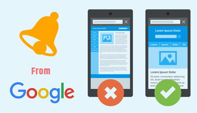
The mobile friendly update by Google was launched this April where the web giant is in a high speed to boost the mobile friendly web ranking on the mobile SERPs. Hence the searchers today get the most relevant search result pages/web links which they can easily read on their devices, without twisting or turning themselves to fight with the pages zooming or pinching them. Highlights of such search results are they can be viewed comfortably, their tap targets are conveniently spaced, unplayable content is not included and no scrolling is necessary to handle them.

The search query is enhanced to pick up a good balance between the website content and website mobile friendliness. Though a website with a very high quality content comes up in the top page via the query, it is an alert for those web owners to wake up and rise up to making their site mobile friendly!

Non mobile friendly websites/all device compatible websites would gradually start getting a lesser mobile traffic when searched in Google where Google does a reprocessing to accommodate the websites that turn from being non mobile friendly to mobile friendly. The process of declaring your website being converted now can be made through using the Fetch with submit to index defined here

Having said on the Google update, it is necessary you get reminded on reasons to redesign/redesigning website, having a responsive web design using HTML5/CSS, having a user friendly website because it’s all about what Google marks you. Isn’t it?

Get smarter, ask us for what you want, be it non responsive to responsive or magento implementation or mobile friendliness to be adopted or UX enhancement or design facelift or CMS integration or anything in ecommerce!