Responsive Web Design

Web Design Trends 2018

Web Design Trends Which Cannot Be Ignored In 2018

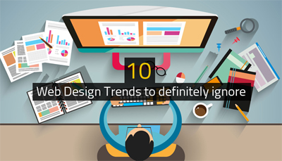
2018 is about to begin and we all know how quick web design trends upgrade with each coming year. Every year there are changes in the technology and web design tools due to which the design ideas and components quickly get obsolete.

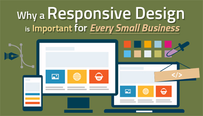
Getting responsive website designed would just not be enough. To stay competitive, it becomes important to keep your website updated as per the latest trends to attract potential customers and ensure consistent growth and revenue in business.

Here we have listed out some web design trends which you may have got introduced to in 2017 itself but are going to dominate web design market in 2018 as well and so cannot be ignored.

Meaningful Illustrations

The Illustration is a great way to visualize your unique ideas. Photography has always been preferred in the form of large hero images and attractive background images. These days illustrations are gradually replacing the photographs as they give a unique personality to your website.

Illustrations get loaded quicker than the photographs. As per Google’s Mobile-First Algorithm, the websites getting loaded faster would provide better user experience and given high preference when search engine ranking is concerned.

Photographs can be edited up to a certain extent only, whereas illustrations can be customized the way you want to. There is lot of scope of explaining even the complex concepts to the website visitors easily through illustrations thus making them highly preferred by website owners, web designers, and digital marketers.

Expressive Typography

Web designers are no more restricted to a particular set of fonts to be used. There are different types of fonts available now one can experiment with and showcase their creativity.

Google is now offering a wide collection of fonts which are free to use. In many instances, the creative typography has started replacing the images even. Similar to illustrations, the text also gets loaded faster and thus improves your entire website loading speed resulting in reduced bounce rate.

Accelerated Speed

As per DoubleClick Study, 53% of visitors leave the website if it takes more than 3 seconds to load.

If you want your websites to generate maximum revenue, you need to ensure that all the elements on the web pages are light weight and get loaded faster.

This doesn’t mean that you should design boring websites missing attractive elements just to increase the speed. All you need to ensure is that the elements whether photos or videos you embed on your website should be placed for the improvement of user experience and not for mere showoff.

Geometrical Layout

These days, the card-based layout is highly popular as most of the people visit websites using their mobile devices. Tile theme is also another geometrical layout which is gaining high popularity.

You must have visited Pinterest and knowing the comfort it provides to the browsers. Similar to that, if your website represents the content in the card-based or tile-based layout it would give any easy access to the visitors.

The websites with familiar geometric layout are likely to achieve increased session time per user and decrease the bounce rate which ultimately leads to the higher conversion rate.

Attractive Colors and Gradients

A few years back, the websites with light and pastel colors were considered to be professional. On the contrary, these days the website designers are using bright and glowing colors and gradients to attract the visitors and keep them engaged.

However, you need to consider your buyers’ persona before selecting the colors for your website. Not everyone would like to read websites with bright colors. It all depends on the type of audience you are catering to.
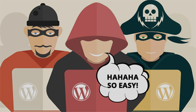
High Security

2017 has seen many hacking and ransomware issues which require being avoided this year. In 2018, we need to be cautious about these issues and improve security features on our website in order to make web pages safer to browse and download.

Dynamic Interaction

Placing an element on the web page which tells you about your visitors is highly used these days as it provides instant feedback of the website user. For example, you can ask your visitor to click on the ratings they want to give to your website and obtain instant feedback from them.

This feedback can be highly useful while analyzing your conversions and finding a room for improvement in future.

Future of Web Design Trends 2018: Expected Longevity

Design trends become popular for providing convenience and solve a problem users may be facing at present. How long these web design trends of 2018 are going to stay or not for a long time can be determined by the benefits they provide to the website users.

Now, when you know the latest web design trends for the upcoming year, you can very well update your website and achieve your business goals. But, not all latest web design trends may suit your type of business. Don’t just choose a web design trend because everyone else is doing it. Consider your buyers’ persona and business goals, before executing a new web design trend to your website.

10 Web Design Trends to definitely ignore

10 Web Design Trends to definitely ignore

Evolution of Web design right from 1990 has shown us a lot of trends and today website giants like Amazon just know what works the best in website trends & do use it to their benefits! So what should you ignore in web design trends?

  • Loading screens in home pages are too slow for a site to begin with. Smartphones being the highest point of entry of a visitor onto a website, loading screens could leave the site with slower loads, weaker hardware, slowness due to limited data plans and overall a poor web performance. Ignore loading screens!
  • Among the website trends to ignore, mobile popups are the next in queue. While marketers may think they do good, users comment they do more harm than good. They eat up the whole screen space, wait for everything else to load causing interruption to read on the main web content already loaded. While you may need to use them, try ways to put them less intrusively!
  • Parallax and scrolling modes of the pages when overdone is a big headache to the users. Even if used, it’s not for the mobiles but for desktops only! Using lightweight codes is a must even when used on desktops so you don’t stand out giving a sorry figure to the people!
  • Auto play media files on home pages are the most annoying to the users because to the multitasking users it’s a distractor or something that forces them to do something & they definitely wouldn’t end up doing it rather they do hit the back button & get flushed out of the site!
  • To manage the less space for navigation menus in small screens, mobile designers took up to hidden menus; this is a very bad idea as it creates a bad impression to the user who has to click an extra time to view every other page. It’s good to keep away from such designs!
  • Bid a bye to Mobile version of websites! They are not received as much as the responsive websites are! Responsive designs provide the best layout and the ultimately optimized experience!
  • Heavy texts on websites is no more an interest to the people! Cut down the text and resort to interactive images or smart art form of messages!
  • SEO copywriting is something to be given a farewell. Use the right content on messages, copywriting to be used to build up the brand and not focus on SEO exclusively!
  • Old pay per click is not received anymore. Focus on contextual advertising, targeted ads and online content specific to intended users!
  • The technological giant Apple favours flat UI instead of skeuomorphism; keeping away from gradients and using cleaner simpler designs are received today!

It’s high time you bid bye-bye to these design trends and incorporate the trends a pro-business would do today! If you require assistance in such web facelift services, ask us now for you are assured the best!

10 Reasons why you need website maintenance

10 Reasons why you need website maintenance

Every company takes an immense effort in projecting or marketing the company’s offerings, by all means, in all directions, during its first time launch to reach the maximum people possible. The company website launch is a part of this venture for which the teams spend a lot of effort to get the best site. But then what happens if this is left as such even after years together? Not upgrading the website periodically does affect the business; Beware!

Website maintenance is important why?

  1. Without the latest/recent hand of experienced professionals on web pages redesigning, image updates or so, the site tends not to give the competitive edge it once did!
  2. CMS Website maintenance is necessary to keep the content fresh, unique and up-to date with the trends. Performance checks, report generation, and regular support is needed to have the site safe and competitive!
  3. Bug removal, troubleshooting in case of breakdowns to control downtimes are to be included as a part of the maintenance to keep the site fresh & performing.
  4. Website backup saves effort, time and money in case of failures.
  5. Revision, edit and modification with every new web page addition, software updates & so reduce security breaches and keeps the site dynamic
  6. Maintenance makes the site stand apart amidst others in the market. Hiring professionals to do these is always a better option than doing it ourselves for the simple edge of expertise they execute in the journey.
  7. Maintenance, not only addresses the bugs but also saves you from falling for a big unexpected failure all of a sudden due to the site being very old. Repairing and rebuilding post a failure is a tragedy!
  8. Without maintenance, forms may start malfunctioning, notifications & other important modules may go offline for no obvious reason, and all may end up in you losing sales. Don’t let it happen!
  9. User experience is a big aspect that needs to be looked into when you ask “why need website maintenance“. Website being the first point of contact for the customers is the first impression he/she gets. Potential customers may start walking out of the site if they get fed up with a site looking as tired as they look!
  10. Visibility enhancement to Google & other search engines can happen only when the site looks fresh and new!

Regular maintenance post the website development could be made easy with quarterly, semi-annual or annual plans where the payments could be handled easily too. Needless to say, regular maintenance in web development is needed because it adds a lot of value to the site, company and you saving you time and money in a long term. If you require assistance in web maintenance services, ask us now!

Golden rules for designing mobile UX

Discussions at the level of world summit puts forth the below in short on UX design guidelines: Striving for consistency, catering to all customer usability, offering clear details, clear call to closure, error-free site, making reversal possible for any action, & reducing memory load.

Another book on rules of web design states placing users in control, reducing the memory load and making the design consistent for users as the rules for design of user interface.

In the world of smart phone domination today, website redesigning or website creation must take responsive web design/ mobile friendly website/ user friendly website/ all device compatible website into consideration in order to provide the best mobile UX.

To mention the results consolidated yet in a detailed manner especially for mobile user interface experience, the below 10 provide the content,

  • The design to ensure task-oriented flow and user-centred procedure
  • There requires a good amount of effort in adding a meaning and value to the UX in any web design
  • Leniency to be given to the users to an extent
  • Smaller screens to be used as much as possible so that the user doesn’t have to pinch/zoom to get a clear view of the site
  • Standard patterns to be leveraged. User task to be conveyed clearly, consistency across products is necessary, user interaction to be inform, aesthetic appeal, giving an exploration possibility to the users come under giving a standard interface.
  • Gesture intensive designs, as in, swipe, pinch, or tap are essential to make the mobile designs at the best. Type of action, action location on the screen, and the user ease to access them are the details to be contained in the gesture incorporation
  • Smart motion design which is an attempt to create a visual make of the website synthesizing all principles of a great design with all the possible innovations in science and technology
  • Clear communication in the design; the images and content to depict what you offer and what the user gets from you. A picture is more powerful than the words; images go to a long term memory and the words sit in a short term memory in us; the best visuals to be contained
  • Making sure to invest as ideal as possible on the first time user experience. This is the most important to be taken care, making note of showing the web sections in a cool manner, giving neat & clean directions and making things quick for the user
  • Making sure not to force registrations; allowing guest check outs and rewarding for account creations.

While some of the above rules may sound complex, it all lies in a simple expertise of design principles to achieve them. If you are looking out for non-responsive to responsive conversion services or redesigning mobile UX or perform the web design entirely, ask us at QeHTML for the best experience!

How to Improve WordPress Security?

How to Improve WordPress Security?

Hacks on WordPress, reported last year, aren’t any less to be ignored and most of them are attributed to websites missing out on version upgrades. Core, plug-ins when not up-to-date or when insecure or when not rightly configured contributes to hacker attacks on the site. Don’t be surprised to know stats from the WPScan Vulnerability Database that says more than 50% of the vulnerabilities (1570 on 2407) are ‘just unique’ ones! How to improve the security for WordPress/ prevent hacks on WordPress? Read on.

  1. Stop using the default admin account because most hackers guess it! Make sure to provide a different username during WordPress installation or make it unique if you already have a weak username.
  2. Prevent comment spam by disabling comments after 30-60 days of the blog posted date. A huge number of WordPress sites get affected by comment spam and become irreversible losing a lot of information. To edit a WordPress post, disable “Allow comments” from the Discussion Meta Box. To disable comments for the entire site, get into Discussion settings and switch off the checkbox allowing people to add comments on new posts.
  3. Remove the login link by getting into Appearance within which Editor followed by Footer.php and removing the link here where you have defined the Copyright.
  4. Ensure WordPress is up-to-date because anyone can easily modify the source code, it being an open source tool. Every time vulnerability is reported, WordPress fixes it in its next version; no wonder you don’t update the version and then you get attacked! Getting the new features, higher speeds, better or newer compatibility with add-ons are other good things you crack by being updated.
  5. Make sure to report the security issues or bugs on WordPress immediately. To prevent the damage spreading across more and to release a quicker fix, every security issue is ought to be reported to the WordPress core development team immediately.
  6. Don’t leave the file permissions or write access open! Wp-admin/options.php should be owned by you and permissions set to 644.
  7. WordPress security plug-in is highly necessary. Don’t miss to have it and limit the attempts of login! Certain attacks simply try username/passwords repeatedly and gets in somehow. Limit login set up blocks the IP temporarily and stops consecutive login tries. Extra protection by captcha and redirection to home page on abnormal requests are to be taken care inclusively.
  8. 2 step authentication is powerful than just a single step. 2 factor auth plug-in restricts anyone from having access to the site without being able to access user’s mobile phone or mail box. Generating OTPs using apps like Google Authenticator is highly recommended. For slow mail servers, go with HOTP; for better servers choose TOTP which is the better one.
  9. Ensure the pc is not affected by any malware.
  10. Ensure the site is on a secure hosting of WordPress.

Having the right CMS/content management software/ content management platform for content update on the website, having a responsive web design or a responsive website is highly important in terms of making more conversions. But then if you lack in the basic security checkpoints, what’s the point in having all the other features; you become the hacker food quite effortlessly! If you believe you require an enhancement to the WordPress Security or any assistance with regards to ecommerce services, contact us at QeHTML right now!

How Do WordPress Blogs Get Hacked?

How Do WordPress Blogs Get Hacked?

Websites are hosted on cloud due to the ease it gives in deployment compared to having them on one’s own infrastructure. While there are a lot of positive aspects, security is one of the main & important limitations that are on the negative side of cloud hosting. Storage of vital information as in audit logs is one thing that is quoted as an example of a security attack.

The auditing methods we have in place for firewalls & intrusion detections may be configured but not monitored or analyzed at periodic intervals and the impact isn’t any easy to ignore! Just counting on the website access logs isn’t enough; in addition what’s the frequency of collection, since when is the collection made, is there an access to the logs are all things to be noted.

The below info-graphics covers gives you an edge on hacks on WordPress and security for WordPress,

Hosting contributes to more than 40% of the WordPress attacks, while themes do close to 30%, Plugins do close to 20% and loose passwords make it to the rest of the attacks. Websites not content-managed or those not managed using the right content management software are at the risk; these websites account to more than 80% of those being attacked. Web host servers left with no upgrade contribute to more than 10% of the attacks. Ask yourself if you are using the content management platform that suits your needs at the best!

A website is hacked every 5 seconds and 30,000 are attacked in a day! Out of 1000,000 websites, more than 40000 run on WordPress and of these 30000 of them are among the ones having versions of WordPress vulnerable to attacks. This means 73% of the most 40000 most known sites are extremely visible to the eyes of hackers!

WordPress plugins are the biggest contributors to WordPress attacks; 1305 of them are known today by way of vulnerability databases contributing to a huge 54%. Next comes the theme vulnerability that accounts for 344 attacks, which is 14% of the total while the rest 700s (31%) are WordPress core vulnerabilities! Cross-site scripting and injection of SQL form the base of these plug-in & theme attacks.

WordPress versions 3.0 and 3.0.1 occupy the top most position among easily attacked WordPress versions followed by 3.5, 3.5.1, 3.6. Among the most vulnerable plug-ins, 5 are commercial & they are downloaded around 20 million times; sadly one of them is a security plug-in from WordPress. Yithy, appius, infocus, shotzz, echelon are some of the highly attacked WordPress themes.

While you make a note of how important it is to have responsive web designs/responsive websites/content management, it’s necessary you know more on why there are attacks on websites and how to go about dealing with them!

To prevent hacks on WordPress, there aren’t any complex procedures but a few highly important check points when regularly taken care we are at no risk of our WordPress sites getting food for the hackers. Stay tuned with us to know on these check points or prevention measures to be sealed from malicious attacks! Ask us more at QeHTML.

Why your website is the most essential business tool?

Why your website is the most essential business tool?

Irrespective of the size of the business, a website is a must; it’s the most indispensible business tool a business cannot avoid having. Coming to how it should be, it’s just not enough with a good look but has a long way to go in terms of the content, content management, navigation, communication window, responsiveness and a lot more. When the internet bloomed 2 decades above, a website sat on basic html, text and a few images; since then it has gone through various developments till today where the internet and technology drives the need of responsive websites owing to the growing use of smart phones/tablets.

How should be a website so it serves as the best outface of the business?

  • Mobile friendly websites refers to a website that looks the best on hand held devices as well, having the right size of single column, navigation-friendly and basic yet effective design. Don’t be surprised to know they are the most favourites for the Google algorithm! Mobile optimized websites are exclusively designed for phones and may mostly redirect you to the desktop version due to the inability to accommodate a lot of features. Responsive web designs/mobile-responsive sites are the best of the above where the site restructures itself to the size and resolution of the device; these are the ones picked up by the search engines!
  • Content and management: It’s with the content people engage in your website. Having the most relevant content, in simple terms, just to the context yet effective and having it regularly updated by way of content management systems is a big criteria for the search engines recognize you
  • Landing pages: Landing page design is one of the most important aspects in website development. They should relate at the best to what your website intends to convey, with the right text, content, images, videos, graphics, to the intended audience and navigation!
  • Customer-centric: Creating a customer centric design is necessary rather than just trying to sell who you are. Make sure your website conveys what you can do for the users
  • SEO: The websites being search engine optimised is yet another necessary design aspect of the web design and drives what your website ranks in SERPs. Having a prominent search button is required; it is the combination of these both that pushes your site to the top most result page. Don’t be shocked to know more than 90% of the users don’t even go to the page 2 of results!
  • Clear strategy and brand-driven: Having a great marketing strategy requires defining feasible long term and short term goals, web designer knowing how to bring them in, and most importantly to convey them in a manner every user can interpret which is very crucial to generate traffic
  • Online marketing: Web marketing like Google Adwords highly target online advertising so the searchers are directly taken to your website. Make sure to have this optimised if not yet done!
  • Call To Action: Directing the users straight and distinctly to the CTA buttons is required so the users get to know how to ask for your services/products.
  • Website redesigning is necessary simply because trends keep changing, user expectations keep rising (is there anything more you need for the reasons to redesign?!) and it’s quite obvious you need to keep in par with the customer needs in terms of how the website looks and what it conveys. Html5/CSS for coding, content management using WordPress, Drupal, Joomla, are all some of the basics to be taken care; if you are missing out on them, be alarmed it’s high time you do the redesign.

While you do the best of offline marketing and other forms of business communication, make sure you don’t miss out on having a website which is the inevitable business tool towards the business growth. If you are on a look out for assistance in any of these or more in ecommerce services like responsive conversion, website redesign or more, do contact us at QeHTML!

Planning to Facelift your website? Read this first!

Planning to Facelift your website? Read this first!

Redesigning website is not just giving the site a new look aesthetically but then grooming it or building it to combat the needs of today’s customers. Rising use of smart phones drives most website users to logon to the sites on their hand held devices more than they do on desktops. Looking professional with all the relevant content is no more just enough but easy navigation in mobiles & tablets is a necessity which is where mobile friendly , user friendly and all device compatible websites come into the picture. Even a small or medium sized business is expected to have these features if it has a bigger insight towards future! Join us to walk through a few points on what to consider in a website redesigning/on reasons to redesign.

  • Responsiveness: Non responsive websites don’t look good on hand held devices or require adjustments in order to give a reasonable user experience. In either case, they aren’t providing a satisfactory user experience. If you target an excellent UX, take up responsive web designs.
  • Generation of traffic to the site: One of Google’s very basic criteria for a top rank in SERPs is the site responsiveness today. All Google wants is to provide ‘simply the best’ to its users who are hooked onto mobiles/tablets today which directly explains why you need to go responsive.
  • Mobile search: Most customers today start an item browsing on their mobile devices and may complete the purchase on the device or on a desktop. This explains they require the best search experience on mobiles for which going responsive is a must.
  • Content: Developing original content and revamping the content every few days is necessary to create or enhance your brand, show that you provide a great value to customers, and to stay apart as a leader in the competitive market.
  • Media connect: To let people know more on you and to share your business products directly to the media forums, it’s essential you develop an excellent social media connection strategy. To show you are transparent in connecting with the current customers and prospects, it is necessary you strengthen the social media engagement while going for a facelift.
  • Analytics: An appreciable data analytics is necessary to track the operations in line with the company goals.
  • Communications: Setting up feasible deadlines of operations, declaring the plan and finally letting people know the change in clear terms is important so they know you are transparent in communications and they can trust in you.
  • Content management system: Having a good content management system is necessary rather than having to depend on manual updates. HTML5/CSS is highly recommended for the mark up language code in website development.

To talk a bit on what makes the site responsive,
Having a framework for easy placement of objects, text and all other elements, setting up an optimal screen resolution & auto adjustments based on the device used, having the right hyperlinks for contacts and similar needs, easy UI navigation are all some aspects of a responsive site.

There are a lot of platforms available today to convert a site to a responsive one. WordPress is one among them, which is mostly mistaken for just a blogging platform.

If you are in plans for the website redesign, looking out for an expert advice in redesign or for the redesign services from scratch, contact QeHTML for the best results!

Why a Responsive Design is Important for Every Small Business

Why a Responsive Design is Important for Every Small Business

Responsive web design indicates a website that gives a smooth browsing experience to the user in mobiles or hand held devices as well, without demanding them to go through scroll, zoom, and pinch in or so to get a view of the website content. It is different from having a separate mobile friendly website where 2 different urls demand double maintenance efforts. Single content-single code combination in website development is what leads to an all device compatible website/responsive website.

Customers look for your company website on their mobiles and they would of course want to get the details in the easiest manner. Product information, contact details, search are some basics one needs to take care in design considering an appreciable small business growth without which most customers would leave the site!

Google’s SERP algorithm is complex; it considers more 100 factors to determine a web page ranking; Of this website responsiveness is one of the top most factors! Site bounce rate, customer reviews are all related to the mobile friendliness of the site and increased bounce rates directly contribute to lower rankings.

Video or image load on mobiles/tablets should be quickest possible because no customer likes to wait. Load time for every content above the fold has to be < 1 second as per Google’s expectations. Responsive websites are the best in providing a user friendly website in the context without which a business is sure to lose its mobile customers in due course.

More than 3-4th of the customers expects a mobile site to look better than a desktop site, simply because they like to do anything and everything on the move rather than having to wait for a laptop or a pc. Those businesses relying on the web traffic to achieve success are left with no option other than making the site responsive; make sure your company does it proactively in view of an excellent business growth!

Reaching more audience is possible only with the provision of a responsive site because more than 70% of the users browse on their phones, more than 40% of them do the purchase on phones, while a lot of them do a search and decision on the mobiles & complete the purchase on a desktop. When the customer buy decision happens in the mobile, then you well know how the website should look, on devices!

One website, one code maintenance is possible with the responsive sites while it may be tough to maintain a separate url for the mobile specific site.

Responsive sites are great for SEO because of the following reasons: Content duplication is avoided, no separate SEO effort needed for hand held devices, higher ranking on mobile search is assured, Google love is a responsive web design!

Increased conversions, a stay ahead in the competitive market, future preparation for the upcoming mobile technology, consistent design, great UX are all the benefits of responsive designs that should no more let you wait to do the design for your site. If you look for an expert assistance here or ecommerce service for the responsive web design, contact us now!

Crucial connection between SEO and User Experience UX Design

Search algorithms of Google are intended to give the best possible results to the users; the huge amount of rolling and revolving around the SERP rules that they do are all made upon thinking in the user stand point. Everything that’s written has to have the best link with the users if not for whom are they written! Should SEO (search engine optimization) and UX be linked in website development has always been a debate but needless to say it is ‘yes’ that wins!

SEO determines if a site ranks among the search engine result pages and UX defines if the users hitting the search are getting the best quality results. If the content scrutinized for top pages by the search engines is great then quite obviously the users are going to get excellent results in the first 1-2 pages of search results. There might a few instances when they don’t go hand in hand but for sure there’s a huge connect between them.

How can top UX methods indirectly benefit for the SEO?

  • Navigation ease: Navigations and XML sitemaps when taken an utmost care for both UX and SEO, we end up getting the direct and indirect benefits of SEO. Proper indexing and easy spot by bots is made sure by site maps and this of course adds to the UX. Site maps also transform the website easier to follow such that users can reach any web page within 4 clicks or even lesser and this is a great ease for the users to get to where they want; and Google indexes the content easily as well.
  • Relevant content: Content for UX has to suffice the requirement of what Google sees as a relevant content. 3 main aspects of a quality content Google quotes are here below,

    — Time metrics: Google has metrics to check if the user that clicks on a result stays there or hits the back; this shows if the content is engaging the user or not.
    — Panda updates: Human evaluations along with algorithmic evaluations are taken up in Panda updates so as to ascertain the user need out of a quality site. Make sure your site suffices most of the Panda requirements
    — Links: Strong link connections to and from authoritative sites sharing the same details as your site does are taken up as strong signals of a quality website, by Google. Make sure you do the best link building

  • Responsive design: Mobile optimization is a major SEO aspect today which is considered one of the mandate requirements of Google ranking criteria as well. Making responsive websites that fit great on a desktop as well as on a hand held device is no more a luxury but a necessity.

A content that’s great in quality, earning UX benefits indirectly is that which is going to give the combined SEO and UX success. Looking for such an expertise web designer to optimize your website/face lift in all the ecommerce aspects, feel free to reach out to us!