Responsive Web Design

Important Web Design Tips for Small Business Websites

Important Web Design Tips for Small Business Websites

Designing or redesigning a small business website well enough to compete with the established businesses can be tough but isn’t impossible. Get to know some tips below to have a professional competing website that stands out or stands alongside the existing running websites,

  • Have prioritized goals!
    To focus the website on attaining specific goals, it’s necessary to have goals prioritized. Accommodate customer services, then concentrate on the content and images, then about generating the traffic, followed by capturing the leads and so can be some of the goals.
  • Get the traffic!
    Traffic just doesn’t fly from the clouds. Do the needful. Impress the existing customers to get new visitors. Use the advertising services, talk in directories of businesses, connect with social media, invest in PPC, do the perfect SEO and so on to get the traffic.
  • Get the web designer on board soon!
    Establish the best communication with your web designer; know what he wants; give it at the quickest possible. Delaying the web design isn’t a good sign for flourishing businesses because it is via online forums people get to know things today.
  • Use a common website platform!
    More options to seek help, getting all sorts of support, making upgrades or changes, using common content management systems like Drupal/WordPress/Joomla are all quite easy using a common platform; use a common platform while you raise up to stand uncommonly!
  • Clear goal and clear content is a must!
    The website has to be built totally around your goal, so have the goal clear in your mind at the first place. Make your content to convey the same. The website with a clear goal and a well-built content using the relevant supporting images is definitely on the way of flourishing websites.
  • Tell customers what you are to them
    Make sure the web content clearly communicates what customers can get from you or what you are to them rather than just bragging about who you are. No one bothers on what you do unless they benefit out of it; so make sure you make it crystal clear what you are benefitting the customers.
  • Call to Action and landing page design are important
    For an ecommerce website, it is very important the checkout process is quite simple and easy to follow. If you are looking to create conversions, then you should make sure you create the Call to Action buttons clearly on your web pages. Make the landing page with the right content, image, product description in the right language in the right fit, that is, just the best one!
  • Page hierarchy to be clear
    Make sure the homepage or the product hierarchy page clearly shows the structure of the items in your website so that the visitors quickly get to know what they want and if you have it. No one wants to struggle to get what they want.
  • Personal accomplishment or feedbacks to be projected
    Every visitor believes in existing customers. Make sure you project the good feedbacks or positive customer reviews well enough on the website in prominent portions of the page.
  • Make it easy for Google to index you.
  • A genuine web host with a great customer service is a must. Ensure you have your website hosted aptly.
  • Needless to say, ensure to have a responsive website, you know well why!
  • Establish clear communication channels. Make sure customers find it easy to contact you. Put the contact details on the site, also smartly get their mail ids for further promotions.

Having spoken about doing the perfect SEO, ensuring a fast Web page speed, doing the content and image optimizing, having the right valid backlinks, having a responsive web design/mobile friendly website/user friendly website/an all device compatible website, doing the web facelift, it is necessary all don’t happen in a day. You require a professional in the website development/web design to do it for you. Keep the trust in us; ask us, for we assure you one and only the best!

Guidelines for using Responsive Web Desgin

Guidelines for using Responsive Web Desgin

Endless resolutions and devices necessitate the usability of a website on any device of any resolution at any point of time and obviously speaking each version is meant to be perfect in order to lose no visitors. An all device compatible website alone can be a solution to accommodate the situation in current day website development. Isn’t it? Responsive web design is doing the web development in such a way that the site responds to any user’s behaviour on a device of any screen, any size and any resolution/orientation.

A mix of grid layouts, images, smart use of CSS queries, automatic switch-ability based on resolution, accommodating images of any size and layout are some of the features a responsive website is meant to suffice and comes up with. It is not just about creating a mobile friendly website or a user friendly website but thinking differently for a new way of design.

To mention on adjusting the resolution of screens based on the device, in responsive web design, various size, colour, functionality and portrait/landscape layout should be thought of and incorporated. It’s not just about portrait/landscape but hundred other different screen sizes are to be taken up, grouped into major categories and make a flexible design of each; this might go tedious as the number of devices keep raising.

What can be done about it?

  • Flexible layouts: Enable automatic adjustment of images, non breaking lay outs, and designs that are flexible so that they get perfectly adapted when the devices move from portrait to landscape in a minute or when people switch from larger desktops to iPads or other tablets.
  • Use techniques for images: Image adjustments such as revealing them or hiding them as necessary, composite sliding image creation, creating the foreground images such that they scale well with the layout, dividing complex images into 2 as in one set as the background cropped and maintained while the other set such that it resizes proportionally.
  • Flexible images: When no other image styles interrupt, images load well provided the viewing width doesn’t become too narrow for the image width. But in reality when the height and width of the devices keep changing, the best is to have fluid images where the dimensions aren’t given in the code but left to be picked up dynamically based on the browser resize, using CSS for relative sizing. Take care of download times that shouldn’t become too long for bigger screens causing slower page loads.
  • Filament group’s responsive images: This technique shrinks the images on smaller devices not wasting space on the screen, in addition to resizing them. Consider this technique that’s supported in all modern browsers for websites with a lot of images, to save bandwidth and load time.
  • iPhone simulators: Web designs auto rescale to fit smaller screens in iOS, however this design resulted in images changing with the page even if they could fit into the screen that made other text scaled down. Take care of the viewport meta tag when using this.
  • Call a media query with CSS features max width, device width, orientation, color, screen, print, handheld for devices that support CSS3.

Hiding/showing the content, incorporating CSS3, using the right way of responsive web design, using different techniques to support touch screens and much more techniques exist in way of making the perfect ecommerce website to be given to today’s customers with their growing needs. If you are on a look out for a smart professional to do these for you, don’t hesitate to believe in us; and be sure you are getting the best always!

Google Alert for non-mobile friendly websites

Are you a mobile search freak? The news here is for you!

Google comes up with an update purely for today’s mobile obsessed generation of users! Why not the users get all the privileges when they put in a high figure on the smart phone purchase and on a fast blowing internet pack?

The information a customer gets should be independent of his search device, be it a pc or a mobile or a tablet. It is simply because the hand held device users are soaring enormously high in numbers since a few years. It is for the same reason mobile friendliness is brought up as a ranking signal by the web giant Google. Google has rolled out an update to mobile SERP this year this month that enhances the ranking logic such that users get more options of mobile friendly relevant results on a search.

and the Webmaster mobile guide from Google can help you with support on getting a mobile friendly site, so you don’t fall a prey to this update. The update would be severe/strong to the extent that a very good quality content website might be pushed back in Google ranking if it is not mobile friendly, so beware and continue to make your website mobile friendly!

The mobile friendly update by Google was launched this April where the web giant is in a high speed to boost the mobile friendly web ranking on the mobile SERPs. Hence the searchers today get the most relevant search result pages/web links which they can easily read on their devices, without twisting or turning themselves to fight with the pages zooming or pinching them. Highlights of such search results are they can be viewed comfortably, their tap targets are conveniently spaced, unplayable content is not included and no scrolling is necessary to handle them.

The search query is enhanced to pick up a good balance between the website content and website mobile friendliness. Though a website with a very high quality content comes up in the top page via the query, it is an alert for those web owners to wake up and rise up to making their site mobile friendly!

Non mobile friendly websites/all device compatible websites would gradually start getting a lesser mobile traffic when searched in Google where Google does a reprocessing to accommodate the websites that turn from being non mobile friendly to mobile friendly. The process of declaring your website being converted now can be made through using the Fetch with submit to index defined here

Having said on the Google update, it is necessary you get reminded on reasons to redesign/redesigning website, having a responsive web design using HTML5/CSS, having a user friendly website because it’s all about what Google marks you. Isn’t it?

Get smarter, ask us for what you want, be it non responsive to responsive or magento implementation or mobile friendliness to be adopted or UX enhancement or design facelift or CMS integration or anything in ecommerce!

Which CMS is best for your needs

Which CMS is best for your needs?

The revolution, content management systems have caused today, has resulted in a non-technical or a nerd can equally update any website with this tool. While the basic necessities of an ecommerce website, as in having responsive websites/responsive web designs for web development and mobile friendly websites for the best conversions always hold good, it’s not to be missed that having a user friendly CMS is necessary to have the content managed quite independently.

WordPress, Drupal, Joomla are the most popular Content management systems worldwide; picking one of them to choose the specific business profile is the need of the hour.

CMS Comparison chart goes below:

Having seen the basics and goodness of each of the CMSs above, let’s talk a bit on features and stats related. WordPress holds the biggest of the 3 in market shares with 65%, while Drupal and Joomla hold the 3rd and the 2nd most popular CMS respectively worldwide. Free themes and free plug ins are available for all three of them. Frequency of updates is good for all of them being from 30-40 days whereas the choice should depend on the need as per the facts mentioned in the smart art above.

To talk on the skill level needed, Technical expertise is not a necessity and text paste from MS word to a WordPress site is easy while Drupal needs the highest expertise technically also it is the best to produce advanced sites and Joomla is in between WordPress and Drupal where there’s a less effort to understanding it and the best for fairly complex sites.

Having spoken a lot about the 3 highly prevailing CMSs, WordPress, Joomla and Drupal, hope you must have a really fair idea of what your need is and what is the best for you. if you are looking for the best service provider to do this for you, just ask us.

Most Important Factors to be considered before choosing a CMS

The growth of hand held devices and the respective users today have necessitated businesses to use responsive websites or responsive web designs in web development because having a mobile friendly website is very important to broaden the customer base. In addition, having the content at par with the trends and technology is extremely important if you wish to stand apart, as an ecommerce service provider. Having a lot of Content management systems today, WordPress, Drupal, Joomla, CMS Comparison to choose the best and the most user- friendly CMS has become a big challenge.

Eye-alluring CMS doesn’t mean the best-for-use one; let’s go through some of the factors to be considered in studying the systems and the top 5 CMS prevailing today.

What is an open source CMS? A content management tool built on a platform built on a code easy for anyone to use and distribute is termed an open source CMS. To mention on popular CMSs, it is WordPress for blog build and growing ecommerce sites; Joomla for appreciably established ecommerce companies; Drupal for big enterprises. To mention on the ease of learning, WordPress is the easiest of all and Drupal is the toughest while the rest are moderate.

To know which is the best for you, consider,

  • Functionality in crux: Managing a website, that’s creating it, adding, deleting, editing and maintaining the webpages should be accompanied by a few other functions that’s necessary for the core stability of an ecommerce website. Check if the CMS you choose suffices it.
  • Editor capabilities: Editor being one of the core elements of CMS, used by publishers for provision of heading and lists should let the editor have an access to handle images, files and whatsoever is required for the web design.
  • Asset management: A bad CMS design affects the usability. CMS providing for the images are preferred along with the capability of image editing, pdf uploads and more.
  • The best Search option: Users mostly look out for the search option in a website. Make sure your CMS does this at the utmost perfection.
  • Flexibility in customization: The CMS should be easy enough to retrieve and show the content customized for the device/pc. Make sure you check upon this.
  • User feedback: CMS enabling user communication via a chat or comments or ratings is a must, with the necessary plug in or 3rd party interfaces. Check it.
  • Role maintenance: CMS should be capable enough to let the blogger lend permissions of add/change/comment over the blogs or manage the functions/accesses as necessary.
  • Versioning: Having a CMS that controls versioning to get you the last saved state in case of an erroneous move, is an advantage though not a mandate need
  • Multi web support: Driving more than one website with a single CMS installation sounds attractive. Isn’t it? It is useful too.
  • Multilingual possibility: CMS supporting multiple languages is not something to be ignored, even if you are a domestic business today. It eases the future expansion, make sure to have it.

In short, to choose a CMS, consider the below: Adaptability, Manageability, Scalability, Security, User friendliness, Plug ins connected, HTML CSS support availability, Social media & SEO compliance, the ease to migrate and internationalization capability. To get the best of CMS services, don’t hesitate to give us a call or visit our website.

Is your website losing attention?

The website is a revelation of one’s business, brand, motive and customer reach. A visitor turning into a customer for the products and services you sell totally gets decided at the first time the site is visited. Homepage is the greetings which is either going to be successful in retaining the visitor or distract him towards other websites. When you come across the situation where you see the users aren’t sticking long to your website once they access the homepage, you’re sure you’re losing the traffic. Know why!

  • Clutter: Where the homepage is flooded with too much of information, the user doesn’t intend to check many of them and tends to go away.
  • Basic HTML designs: When businesses don’t want to employ someone demanding a good sum and goes ahead with basic html designs, it might sometimes end up in very basic design involving regular text on a basic interface which makes the user suspicious on the ability of the business to deliver complex services.
  • Language blunders: There are some basics which we can never miss to ignore whatsoever be the standard of the deliverables we give functionally. If the products and services you do are just too great but then the website has even a few errors in language basics as in grammar or spelling, it doesn’t give a good view of the business. Authenticity of you is shown here, don’t be careless!
  • Stock Images beyond limits: Only when in high end urgent situations like an article going live much earlier to the planned time or so, one can go ahead with the available photographs. Otherwise mediocre photographs never work.
  • Sound from auto playing flash or videos: Ads throwing their flash video widget content right on the users face or urls playing music at the background isn’t any pleasing to the people these days. They tend to miss the valuable service/product you provide. Regular Java and HTML in a simple interface works the best.
  • No contact details: Make it easy for users to reach out to you. Make sure to provide company’s email address and contact numbers. When it‘s just the mail address, it is quite annoying for some users to wait till the response is received even for simple tasks that take a min or two over the phone. Make sure to have an alluring Contact Us page.
  • Ads aren’t always exciting: Ads are ought to be given a thought as how important they are for the business revenue. Video ads in every page or a colourful banner in corners of the web pages might be your thought but be aware it distracts the users who find the interface too technical. Make sure to retain the average users before you try out these.

Having said these which aren’t any rules for you to stick onto but which have been identified as some of the major causes for declining number of users on a website, if you are looking out for the best web design service provider in web development to create the responsive web designs for your site or implement CMS like joomla to give a great design using images, CSS or so just ask us.

Will responsive web design help increase my product’s sales?

The revolution of mobiles today has resulted in a prediction that by 2018 the number of mobile connected devices would even exceed the world’s population. In this scenario, there isn’t any surprise as to why there’s so much of a stress upon having responsive Websites in web development for an estore or an ecommerce platform.

Responsive websites not just give a great experience to the users but save the time and revenue of the businesses that needn’t have to build separate sites for pcs and mobiles. They add a value to the SEO campaigns due to the simplicity of a single url in place. Above all, Google’s love is the business necessity. Isn’t it? Responsive web designs are one among!

To talk on some figures how responsive websites add to conversion rates, there’s a firm that gives us the data 3 weeks after switching onto the responsive design,

  • Conversions soar by 65.7%, transactions by 112.5%, and revenue by 101.25% for iOS devices
  • Conversions soar by 407.32%, transactions by 333.33%, and revenue by 101.25% for iOS devices

To mention on why responsive websites have created this impact, there are quite a few yet worthy standpoints.

  • User experience: Content sharing is the core of communication between the business and the user via the websites. Responsive websites achieve this at the best. Browsing across multiple devices gives the same great experience as in one device or in a desktop, with responsive sites; no pinching, no zooming, no struggling. Bounce rates might decrease when people find the same content in 2 different views. But then a functional and accessible alternative on any device they use, impresses them to stick onto the website.
  • Audience reach: More than 50% of the population owns a smart phone in united states. What is being used them in the phone is important to understand what can give way to better conversions. Most people (67%) most of the times staring at the mobile for calls or texts even though there isn’t any vibration or tone simply makes it clear of their addiction to the devices. Isn’t this telling you why your website should be mobile friendly, as good as it is on a pc?
  • Good clarity in mails: Talking about emails, KISSmetrics conveys that 90% of the people tend to immediately delete an email if they get to see it in their mobiles, from a business website they aren’t bothered of. The reason for this is the clarity of the mails in a hand held device, click rates thus go down as compared to that in a laptop. Clarity along with good landing page experience for users is absolutely necessary if you wish to grab a million minds. An unappealing landing page leads to lower conversion rates for sure.

If you have woken up for the responsive design trend that’s necessary for every e-commerce platform that tends to cause a big effect on people, and if looking out for the best service provider to implement responsive websites, wordpress, joomla, psd, CMS, drupal or any for sales and business growth, just ask us. We assure you just the best.

Is your non-mobile friendly website the reason behind loss?

It isn’t any surprise to know we are close to the time where most users get to use the internet for the first time in mobiles! No wonder if there comes an age when PCs will just be used for huge researches or white paper preparations or so and all the rest as in shopping, banking, recharge and all around are 100% used in mobiles; Having said this, and knowing that the top most search engines Google and Bing rank responsive websites in top of their SERPs, the business has nothing to do other than grabbing this situation to create more and more opportunities in responsive web designs to survive & flourish.

To jot down distinct evidences of why one should have mobile friendly website with the good flash make up and page speed for the business growth,

  • Smart phones are too good for hand held browsing as they are easy to carry and there are loads of internet service providers with various exciting offers to give the mobile internet at good affordable rates. When a website looks unclear or requires a zoom in and out to read the contents on a mobile, it’s quite obvious the user gets annoyed and pushes him out of it. Wake up! Have responsive websites!
  • Mobile internet and its affordability, as mentioned above, have resulted in 60% of the internet users sitting over it in mobiles rather than desktops.
  • Google maps are something we now use whenever we go out to a place we aren’t sure to direct ourselves. With people searching for you and your business location for their nearby services or outlets, it’s quite straight forward you go to doom when you don’t own a mobile site.
  • Today’s trend in shopping is surprising to the level that people while inside the physical shop still order online and collect from the store to avoid long queues or to avail mobile specific discounts or to ease their item search or for various other reasons. When such a customer finds you in the web and goes out to your mobile app, just imagine the situation where your app isn’t user friendly? The user just walks out to another app that’s responsive to their needs. Wake up!
  • Google’s mobile friendly algorithm update made in April 2015 clearly tells why mobile friendly websites are considered top most in providing the greatest user experience, in SEO and hence in the rankings.
  • Having different mobile apps to accommodate different platforms isn’t a great idea at all simply because fighting among the 10000 competitor apps is a big challenge and we don’t want to put ourselves into a bigger challenge having to fight for not just one but 3-4 or more in the crowd. Responsive websites solve it all.
  • With the rise of smart handsets, headphones, internet technologies like 3G/4G, wifi, giving an outstanding user experience is a meagre standpoint every business has to achieve. A good mobile website is ensured to attract the customers and to use you for their needs where you grow the customer base!
  • A single responsive website is more cost effective in comparison to having one site each for the desktop and mobiles. Along with the man-made resources for support and maintenance, we are forced to allocate man resources as well to keep the sites up-to the mark. With the least number of resources, give the best, use responsive websites!
  • Social media being used on mobiles much higher than they are on desktops, there is a higher chance of accessing the mobile app from a link in the media site and hence in hand held devices.

If you are looking out for the best service provider to set up a mobile friendly website or conversion from a non-responsive site to a responsive one, for your business at an affordable rate, feel free to get in touch with us.

Statistics on mobile usage and adoption

To mention on certain figures about the mobile usage these years, the first and the foremost stunner is that Mobile is strongly believed to go ahead of the fixed Internet access by 2014″ predicted by Mary Meeker, an analyst of technological trends annually.

The mobile statistics curated at Smart Insights in the talk here include the below,

  • Smartphone owners against Desktop owners
  • Usage of Mobile against usage of desktop
  • Ad usability in mobiles
  • Conversions in Smartphone against that in Tablet

Mobile marketing is very important without which one can be sure to stay unnoticed in the business for any number of years together remaining the same. Let’s try to understand what customers react to using different types of mobile devices and desktops. While the mobile trend was as low as 400 million users globally in 2007 with the desktop users being close to 1100 million users, in 2014 the curve has grown enough that both coincide to be a single figure which is 1700 million around. In 2015, with not much surprise, mobile users have surged past the desktop ones.

To mention on the key trends,

  • Mobile media has now overridden desktop and rest. As an example, taking the data in US, mobile media time is higher at 51% compared to the desktop which is at 42%. Dissatisfactory mobile experience or the complete absence of your website in the mobile search is sure to push you out of the market.
  • Time spent on different types of screens taken through the data from 2010 till 2015 shows the steady increase of mobile screen usage compared to the desktop, tv and other devices. While the tv, desktop and other device usage has been consistent all through these years, mobile has grown from being used for just 0.4 hours a day to 2.8 hours a day in USA.
  • Advertisers are yet to respond completely to the mobile media trends. Checking the 2014 statistics of how businesses spend time in Media or in the advertising spending, while 24% of the expenditure is made in mobile only 8% of it is put on advertisements.  In 2015 mobile ad spending is better accounting for 49% of digital ad spending almost the device usage! These stats also convey what’s projected for future, which is important as it shows where how the market is. The future of digital is mobile, and within 3 years it would dominate digital ad spending.
  • More than 3-4th of the internet users owns a smart phone; In addendum, emerging yet other smart devices are smart tvs, smart watches and smart wristbands today. Google’s research says search was the key starting point for increased mobile usage. It accounts to 48% while branded website usage and app usage account to a lesser figure.
  • Among mobile app and mobile site, more than 3-4th of the users prefers mobile apps.
  • Add to cart rates and sales conversion rates are much lower for smartphones compared to desktop which raises the question how much businesses are taking mobile responsive sites seriously!

A few more statistics added to these definitely removes the anxiousness why one should make mobile friendly website, how it adds benefit to business growth to increase business revenue, why responsive web design important, how mobile usage has increased and how Mobile advertising responses should open the eyes of businesses. If you are in search for the best web development services, no wonder why you should contact us!

Lessons for your Restaurant’s Website!

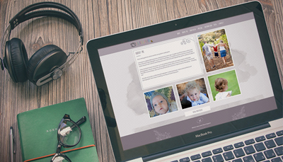
Yummy foods need to look yummy in the web otherwise they will never be known yummy. It isn’t just a rhyme but it is highly important restaurant website and food websites project the foods in an excellent looks in the web be it in desktop url or in the mobile site. What all to care upon in a hotel web design? Ride along,

  • Photography is the soul!

This isn’t any hyperbole. To sell even a shampoo or a tooth paste, a retailer puts in efforts to make the product look bright and just too nice to grab the customer attention and then comes the subsequent pay based on the real quality. Just imagine how amusing the food has to look then to get the mouth water out of the people?! Poor photography does more loss than the poor food for the first time prospects as they would never be turned to customers. Exhilarating photos could earn more bucks or not is a question ‘two’ but bad photos are never going to, in first place

  • Atmosphere matters, for no one likes to sit in a dirty place to eat!

Visuals for a restaurant website should consider not just the foods but the building ambience and the physics of the place as well. Having great foods in a great place is what we look for. Isn’t it? Not just an excellent food in a stinking atmosphere.

  • Dress code for the hotel staffs should be professional and amicable!

How the people, who serve, look really matters in customers getting drawn to the place. No one likes to get served from someone who doesn’t look presentable, quite obviously! Having a great dress code, neat and professional for the hotel staff is very important

  • Texture and colours if dull, then is it going to be liked by you? Just ask yourself!

Texture is a wonderful magic quite available in your own disposal as a restaurant owner. The home page with various awesome textures in back ground and as well in the actual photos is the niche of top designers. Colours set the moods of people and enhance the hunger or even create it completely! Bright colours are a great choice; don’t be hesitant to play with them ‘sensibly’!

  • Break down ingredients makes a mark too!

Showing fresh fruits or fresh veggies or sauces in their half cooked form or desserts while in the process of completion entices the people because they know you use real stuffs to get the quality foods.

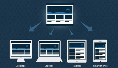
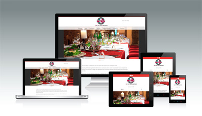
  • Custom menus for desktop and mobile is important!

Food menu used for desktops shouldn’t be used for mobile sites for the simple reason no one likes to pinch, zoom and read but loves to see the texts just handy to read as such.

  • Basics should go in!
  • What is served in the appropriate menu and graphics
  • What is served in the appropriate menu and graphics
  • Cost for the items
  • Graphical representation of the place to show the ambience
  • Whereabouts of the place
  • Ability to make reservations online
  • Contact number

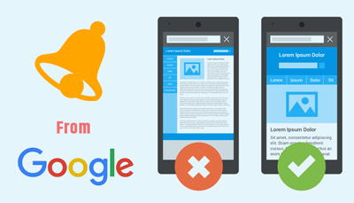
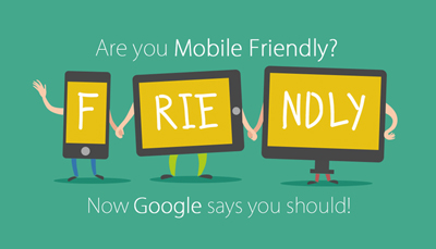
Knowing the basics of web designs, tactics for Responsive Websites, about why responsive web design important, how mobile friendly website contribute to benefit business growth and increase business revenue, what are the nuances in designing restaurant website for a greater business growth and more, we ensure to give you the best for your restaurant website in mobile or web. Just ask us here.