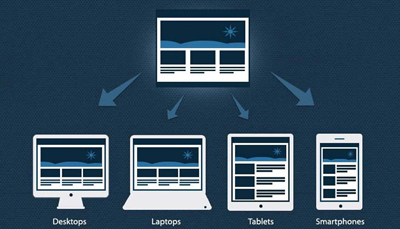
Endless resolutions and devices necessitate the usability of a website on any device of any resolution at any point of time and obviously speaking each version is meant to be perfect in order to lose no visitors. An all device compatible website alone can be a solution to accommodate the situation in current day website development. Isn’t it? Responsive web design is doing the web development in such a way that the site responds to any user’s behaviour on a device of any screen, any size and any resolution/orientation.
A mix of grid layouts, images, smart use of CSS queries, automatic switch-ability based on resolution, accommodating images of any size and layout are some of the features a responsive website is meant to suffice and comes up with. It is not just about creating a mobile friendly website or a user friendly website but thinking differently for a new way of design.
To mention on adjusting the resolution of screens based on the device, in responsive web design, various size, colour, functionality and portrait/landscape layout should be thought of and incorporated. It’s not just about portrait/landscape but hundred other different screen sizes are to be taken up, grouped into major categories and make a flexible design of each; this might go tedious as the number of devices keep raising.
What can be done about it?
- Flexible layouts: Enable automatic adjustment of images, non breaking lay outs, and designs that are flexible so that they get perfectly adapted when the devices move from portrait to landscape in a minute or when people switch from larger desktops to iPads or other tablets.
- Use techniques for images: Image adjustments such as revealing them or hiding them as necessary, composite sliding image creation, creating the foreground images such that they scale well with the layout, dividing complex images into 2 as in one set as the background cropped and maintained while the other set such that it resizes proportionally.
- Flexible images: When no other image styles interrupt, images load well provided the viewing width doesn’t become too narrow for the image width. But in reality when the height and width of the devices keep changing, the best is to have fluid images where the dimensions aren’t given in the code but left to be picked up dynamically based on the browser resize, using CSS for relative sizing. Take care of download times that shouldn’t become too long for bigger screens causing slower page loads.
- Filament group’s responsive images: This technique shrinks the images on smaller devices not wasting space on the screen, in addition to resizing them. Consider this technique that’s supported in all modern browsers for websites with a lot of images, to save bandwidth and load time.
- iPhone simulators: Web designs auto rescale to fit smaller screens in iOS, however this design resulted in images changing with the page even if they could fit into the screen that made other text scaled down. Take care of the viewport meta tag when using this.
- Call a media query with CSS features max width, device width, orientation, color, screen, print, handheld for devices that support CSS3.
Hiding/showing the content, incorporating CSS3, using the right way of responsive web design, using different techniques to support touch screens and much more techniques exist in way of making the perfect ecommerce website to be given to today’s customers with their growing needs. If you are on a look out for a smart professional to do these for you, don’t hesitate to believe in us; and be sure you are getting the best always!


 Menu
Menu