Mobile Friendly Website

Golden rules for designing mobile UX

Discussions at the level of world summit puts forth the below in short on UX design guidelines: Striving for consistency, catering to all customer usability, offering clear details, clear call to closure, error-free site, making reversal possible for any action, & reducing memory load.

Another book on rules of web design states placing users in control, reducing the memory load and making the design consistent for users as the rules for design of user interface.

In the world of smart phone domination today, website redesigning or website creation must take responsive web design/ mobile friendly website/ user friendly website/ all device compatible website into consideration in order to provide the best mobile UX.

To mention the results consolidated yet in a detailed manner especially for mobile user interface experience, the below 10 provide the content,

  • The design to ensure task-oriented flow and user-centred procedure
  • There requires a good amount of effort in adding a meaning and value to the UX in any web design
  • Leniency to be given to the users to an extent
  • Smaller screens to be used as much as possible so that the user doesn’t have to pinch/zoom to get a clear view of the site
  • Standard patterns to be leveraged. User task to be conveyed clearly, consistency across products is necessary, user interaction to be inform, aesthetic appeal, giving an exploration possibility to the users come under giving a standard interface.
  • Gesture intensive designs, as in, swipe, pinch, or tap are essential to make the mobile designs at the best. Type of action, action location on the screen, and the user ease to access them are the details to be contained in the gesture incorporation
  • Smart motion design which is an attempt to create a visual make of the website synthesizing all principles of a great design with all the possible innovations in science and technology
  • Clear communication in the design; the images and content to depict what you offer and what the user gets from you. A picture is more powerful than the words; images go to a long term memory and the words sit in a short term memory in us; the best visuals to be contained
  • Making sure to invest as ideal as possible on the first time user experience. This is the most important to be taken care, making note of showing the web sections in a cool manner, giving neat & clean directions and making things quick for the user
  • Making sure not to force registrations; allowing guest check outs and rewarding for account creations.

While some of the above rules may sound complex, it all lies in a simple expertise of design principles to achieve them. If you are looking out for non-responsive to responsive conversion services or redesigning mobile UX or perform the web design entirely, ask us at QeHTML for the best experience!

Things to know about PSD to Wordpress

Things to know about PSD to WordPress

PSD image form is the one we open with Adobe Photoshop or other image edit software but to run it online on WWW and even to do an optimized data maintenance with less time consumption, it is required we have it in a suitable format. A good looking user-friendly design and an efficient coding are the 2 basic needs of a great web design. Amateurs need to know the 2 basic phases of web development, web design and coding for which the knowledge of PHP, JavaScript, HTML and CSS is necessary. Photoshop is used for designing due to its easy options post which PSD to HTML/CSS is made; however coding it is not easy and this is where WordPress, the best open source web build and user-friendly CMS tool helps to create a high-quality website!

Conversion of PSD to WordPress isn’t complicated but at the same time requires 5 steps to be followed for the ease of doing it,

  • Slicing PSD is the first and the foremost step which is to cut the design file into multiple image files so one doesn’t have to code the whole design in just one image. Each distinct component is woven into a single image post which the multiple images are combined seamlessly. Image editing using Ms Paint or Adobe Photoshop to get a pixel perfect image is recommended. Also note Features that can’t be dynamically created need to be cut in entirely while header, footer and others that are dynamic needn’t be cut in full.
  • Index.html and style.css: Coding the sliced images into HTML and styling using CSS comes next. Complete roll over effects along with placing pixel perfectly is the main aim. Responsiveness or non-responsiveness is decided here and CSS accordingly used. Name the CSS file as style.css and the html as index.html. W3Schools, https://developer.mozilla.org/en-US/learn/css, TutsPLus give a good learning of HTML/CSS
  • Index.html to WordPress theme: Creating the WordPress theme to upload into the WordPress software is the next; that is addition of functionality to the WordPress theme converted from PSD, using plugins as needed. Once the WordPress theme file structure is available, break the single html into multiple files based on the theme. Then break the index.html into the php files for index, header, footer, sidebar and the rest
  • Add WordPress tags: WordPress function tags inbuilt in the theme are the best over complex html files. Add WordPress PHP tags to the earlier created WordPress theme files (tags and functions here http://codex.wordpress.org/Template_Tags and http://codex.wordpress.org/Function_Reference). Store these WordPress files and place in the folder wp-content/themes from WordPress installation chunk. The custom theme is then activated with WordPress dashboard
  • Add the functionalities: More functionality is easily added with the relevant plugins or using the dashboard. Changing the core code is no more a pain. Installing a drop down (or any other functionality) is so easy with the plugin for it!

Implementing such nuances is very important when making the conversion from photoshop designs and a flawless coding expert is a must. To know more on each of these in web-trends or for services on WordPress Integration or PSD to WordPress or for CMS services or for anything in ecommerce services, don’t lose a chance to call us because you know you get the best from us always!

Things to know about PSD to HTML5

Things to know about PSD to HTML5

Responsive web design, mobile friendly website, user friendly website, all device compatible websites have become the need of the hour for an ecommerce website development to combat the needs of the customers who have grown in numbers in using the smart phones or hand held devices. CSS3 comes alongside of HTML5 so you make a responsive website using media queries.

For beginners who are just getting to work on web design using HTML5 and CSS3, a few step guidelines on PSD to HTML5 conversion will add a lot of value we believe. Read on for the steps,

  • PSD design: To start with, it’s important you have a good PSD file. Make sure you have a sufficient understanding of the venture only when you can come out with the best PSD using the necessary header, footer, navigation, sidebar and all placed appropriately. Also make sure the design is made in layers of Photoshop so that you use the right things at the right place with the help of the slice tool
  • Colors: Colors though come under a part of the PSD design; they require a special attention because they form one of the prime elements behind the success of a website. Color preferences differ even between the 2 two genders. Make sure to select the right colors for your website grasping the theory of colors.
  • HTML5: W3C recommended HTML5 has eased the web design process; images are no more a necessity for a good looking website, CSS3 & HTML5 do a better job for the CTA (Call To Action) rather than an image doing it. An increased load speed is possible due to avoiding high resolution images & flash based videos but don’t miss if you definitely need to use certain images. Make sure you know fully about HTML5 to get the best out of it.
  • CSS3: Website redesigning with lesser codes has been made beautifully possible with the CSS3 raised out of HTML5. Selectors and properties available, 2D/3D transformation choices, gradient, 360 degree transition, border image for border creation, text shadow, and so have made the designing so good for an estore today.
  • Media queries: Media queries to convert a site into a responsive one comes with CSS3. The media dependent style sheets are created to accommodate different media types, as in width, color, height which helps the website easily adjust to the size of the screen of the device in which the site is used.
  • Knowing the PSD to HTML5 doesn’t end here but definitely requires the expertise and experience to use all of these in an appropriate manner in the right context for the right site. If you require any assistance in using them or require a complete web design converting PSD to HTML5 or making responsive websites or any ecommerce service, feel free to give us a shout!

Guidelines for using Responsive Web Desgin

Guidelines for using Responsive Web Desgin

Endless resolutions and devices necessitate the usability of a website on any device of any resolution at any point of time and obviously speaking each version is meant to be perfect in order to lose no visitors. An all device compatible website alone can be a solution to accommodate the situation in current day website development. Isn’t it? Responsive web design is doing the web development in such a way that the site responds to any user’s behaviour on a device of any screen, any size and any resolution/orientation.

A mix of grid layouts, images, smart use of CSS queries, automatic switch-ability based on resolution, accommodating images of any size and layout are some of the features a responsive website is meant to suffice and comes up with. It is not just about creating a mobile friendly website or a user friendly website but thinking differently for a new way of design.

To mention on adjusting the resolution of screens based on the device, in responsive web design, various size, colour, functionality and portrait/landscape layout should be thought of and incorporated. It’s not just about portrait/landscape but hundred other different screen sizes are to be taken up, grouped into major categories and make a flexible design of each; this might go tedious as the number of devices keep raising.

What can be done about it?

  • Flexible layouts: Enable automatic adjustment of images, non breaking lay outs, and designs that are flexible so that they get perfectly adapted when the devices move from portrait to landscape in a minute or when people switch from larger desktops to iPads or other tablets.
  • Use techniques for images: Image adjustments such as revealing them or hiding them as necessary, composite sliding image creation, creating the foreground images such that they scale well with the layout, dividing complex images into 2 as in one set as the background cropped and maintained while the other set such that it resizes proportionally.
  • Flexible images: When no other image styles interrupt, images load well provided the viewing width doesn’t become too narrow for the image width. But in reality when the height and width of the devices keep changing, the best is to have fluid images where the dimensions aren’t given in the code but left to be picked up dynamically based on the browser resize, using CSS for relative sizing. Take care of download times that shouldn’t become too long for bigger screens causing slower page loads.
  • Filament group’s responsive images: This technique shrinks the images on smaller devices not wasting space on the screen, in addition to resizing them. Consider this technique that’s supported in all modern browsers for websites with a lot of images, to save bandwidth and load time.
  • iPhone simulators: Web designs auto rescale to fit smaller screens in iOS, however this design resulted in images changing with the page even if they could fit into the screen that made other text scaled down. Take care of the viewport meta tag when using this.
  • Call a media query with CSS features max width, device width, orientation, color, screen, print, handheld for devices that support CSS3.

Hiding/showing the content, incorporating CSS3, using the right way of responsive web design, using different techniques to support touch screens and much more techniques exist in way of making the perfect ecommerce website to be given to today’s customers with their growing needs. If you are on a look out for a smart professional to do these for you, don’t hesitate to believe in us; and be sure you are getting the best always!

Most Important Factors to be considered before choosing a CMS

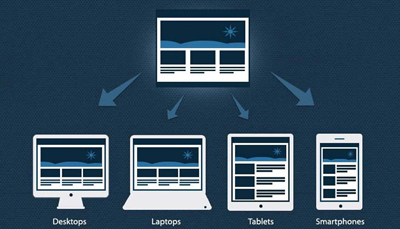
The growth of hand held devices and the respective users today have necessitated businesses to use responsive websites or responsive web designs in web development because having a mobile friendly website is very important to broaden the customer base. In addition, having the content at par with the trends and technology is extremely important if you wish to stand apart, as an ecommerce service provider. Having a lot of Content management systems today, WordPress, Drupal, Joomla, CMS Comparison to choose the best and the most user- friendly CMS has become a big challenge.

Eye-alluring CMS doesn’t mean the best-for-use one; let’s go through some of the factors to be considered in studying the systems and the top 5 CMS prevailing today.

What is an open source CMS? A content management tool built on a platform built on a code easy for anyone to use and distribute is termed an open source CMS. To mention on popular CMSs, it is WordPress for blog build and growing ecommerce sites; Joomla for appreciably established ecommerce companies; Drupal for big enterprises. To mention on the ease of learning, WordPress is the easiest of all and Drupal is the toughest while the rest are moderate.

To know which is the best for you, consider,

  • Functionality in crux: Managing a website, that’s creating it, adding, deleting, editing and maintaining the webpages should be accompanied by a few other functions that’s necessary for the core stability of an ecommerce website. Check if the CMS you choose suffices it.
  • Editor capabilities: Editor being one of the core elements of CMS, used by publishers for provision of heading and lists should let the editor have an access to handle images, files and whatsoever is required for the web design.
  • Asset management: A bad CMS design affects the usability. CMS providing for the images are preferred along with the capability of image editing, pdf uploads and more.
  • The best Search option: Users mostly look out for the search option in a website. Make sure your CMS does this at the utmost perfection.
  • Flexibility in customization: The CMS should be easy enough to retrieve and show the content customized for the device/pc. Make sure you check upon this.
  • User feedback: CMS enabling user communication via a chat or comments or ratings is a must, with the necessary plug in or 3rd party interfaces. Check it.
  • Role maintenance: CMS should be capable enough to let the blogger lend permissions of add/change/comment over the blogs or manage the functions/accesses as necessary.
  • Versioning: Having a CMS that controls versioning to get you the last saved state in case of an erroneous move, is an advantage though not a mandate need
  • Multi web support: Driving more than one website with a single CMS installation sounds attractive. Isn’t it? It is useful too.
  • Multilingual possibility: CMS supporting multiple languages is not something to be ignored, even if you are a domestic business today. It eases the future expansion, make sure to have it.

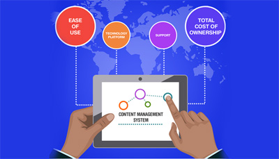
In short, to choose a CMS, consider the below: Adaptability, Manageability, Scalability, Security, User friendliness, Plug ins connected, HTML CSS support availability, Social media & SEO compliance, the ease to migrate and internationalization capability. To get the best of CMS services, don’t hesitate to give us a call or visit our website.

Statistics on mobile usage and adoption

To mention on certain figures about the mobile usage these years, the first and the foremost stunner is that Mobile is strongly believed to go ahead of the fixed Internet access by 2014″ predicted by Mary Meeker, an analyst of technological trends annually.

The mobile statistics curated at Smart Insights in the talk here include the below,

  • Smartphone owners against Desktop owners
  • Usage of Mobile against usage of desktop
  • Ad usability in mobiles
  • Conversions in Smartphone against that in Tablet

Mobile marketing is very important without which one can be sure to stay unnoticed in the business for any number of years together remaining the same. Let’s try to understand what customers react to using different types of mobile devices and desktops. While the mobile trend was as low as 400 million users globally in 2007 with the desktop users being close to 1100 million users, in 2014 the curve has grown enough that both coincide to be a single figure which is 1700 million around. In 2015, with not much surprise, mobile users have surged past the desktop ones.

To mention on the key trends,

  • Mobile media has now overridden desktop and rest. As an example, taking the data in US, mobile media time is higher at 51% compared to the desktop which is at 42%. Dissatisfactory mobile experience or the complete absence of your website in the mobile search is sure to push you out of the market.
  • Time spent on different types of screens taken through the data from 2010 till 2015 shows the steady increase of mobile screen usage compared to the desktop, tv and other devices. While the tv, desktop and other device usage has been consistent all through these years, mobile has grown from being used for just 0.4 hours a day to 2.8 hours a day in USA.
  • Advertisers are yet to respond completely to the mobile media trends. Checking the 2014 statistics of how businesses spend time in Media or in the advertising spending, while 24% of the expenditure is made in mobile only 8% of it is put on advertisements.  In 2015 mobile ad spending is better accounting for 49% of digital ad spending almost the device usage! These stats also convey what’s projected for future, which is important as it shows where how the market is. The future of digital is mobile, and within 3 years it would dominate digital ad spending.
  • More than 3-4th of the internet users owns a smart phone; In addendum, emerging yet other smart devices are smart tvs, smart watches and smart wristbands today. Google’s research says search was the key starting point for increased mobile usage. It accounts to 48% while branded website usage and app usage account to a lesser figure.
  • Among mobile app and mobile site, more than 3-4th of the users prefers mobile apps.
  • Add to cart rates and sales conversion rates are much lower for smartphones compared to desktop which raises the question how much businesses are taking mobile responsive sites seriously!

A few more statistics added to these definitely removes the anxiousness why one should make mobile friendly website, how it adds benefit to business growth to increase business revenue, why responsive web design important, how mobile usage has increased and how Mobile advertising responses should open the eyes of businesses. If you are in search for the best web development services, no wonder why you should contact us!