Responsive Web Design

Reasons to convert PSD to XHTML

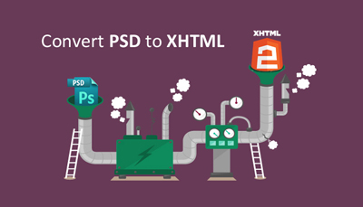
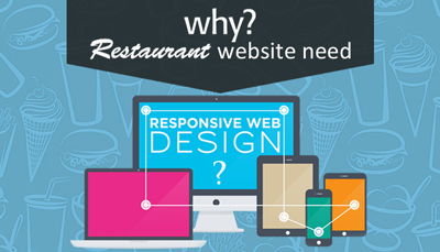
When it comes to reasons to redesign, there are a lot to talk about. Let us look into the specific portion of why there’s a need to convert PSD to XHTML.XHTML in web design is meant to be reliable and more dynamic and highly recommended by experts rather than a PSD. Layouts done in PSD are converted to XHTML, for which the constraints pertaining to the PSD conversion are important to be noted.

Mentioning on the benefits of this conversion and reasons to redesign to XHTML,

  • No constraint in the design then it’s just great. Isn’t it?

Layouts free from tables or any other challenges are more dynamic than the primitive ones. XHTML designs accommodate images and video bars quite easily into the pages.

  • Browser compatible XHTML is totally a need today. Agree?

Backward compatibility and cross browser checking made simply possible in the XHTML ensures different versions of all types of browsers handle the content smoothly. Mobiles and other hand held devices replace desktops gradually today and browser compatibility and responsive web design is one of the basics any wed designer should make sure to implement. Is there a denial?

  • SEO friendly

Search engine friendly mark ups are made possible via semantic coding in XHTML where picture perfect designs impress Google that such websites can never escape to get a great ranking in SERPs. Keywords, the occurrence of those keywords and their fit into the context/content matter so much when it comes to ranking that those lagging these can forget any good ranking. Other than XHTML, these aren’t up to the mark in basic html or any other code.

  • Simplicity is lovely to users. Isn’t it?

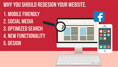
Websites are meant to be simple, less dense, less effort consuming for the designers when more than once and easily readable for the users on desktops and on hand held devices. It is not just the voluminous content that’s important, rather it is the correctness, wholesomeness and simplicity that’s more important. Elements simply adding cosmetics aren’t recommended to be held in the live.

  • W3C validation is easy.

XHTML validation using a simple W3C process is possible and hence XHTML is highly welcomed by W3C though XML can be useful to an extent. Online businesses rely on website performance to achieve conversions, XHTML conversion has a great role here to play, in addition to regulating the quality and weight of keywords.

Having said these to reinstate why PSD to XHTML is important, reliable and highly recommended, it is very important the designers or web service providers are aware of each of these to give the best design solution for ecommerce or banking or any website. If you are looking for an expert design in this context, or facelift for web to print and more, feel free to contact us.

Why Restaurants need Responsive Websites

If you are a restaurant owner and have an optimised Restaurant Website, then you are a step ahead of those who don’t have one and sure to be up to the mark in the current trends and user expectations. Why restaurants should have responsive web designs or responsive websites shouldn’t be a question in you as it is quite obvious today that the hand held devices have totally consumed a large number of people who were desktop users way long back. Yet to know more on it, ride along.

Why responsive web design is important or how a mobile friendly website has a great hand to benefit business growth?

  • Top 5% of the restaurants have a mobile site. Shouldn’t you? An optimised mobile website takes you a leap in front of the restaurants that lack one. People around you can turn into your customers only if they can find you and we well know the number of users using a mobile site outweigh the ones using a desktop. Wake up!
  • People are choosy. Unless they find your hotel menu online, they just skip you to check the next one. Studies say 62% of the customers don’t choose a restaurant if they are unable to check the menu on their devices. And no one finds it easy to pinch and zoom, keep the menu readable as such.
  • Reservation pulls people to you. Open table reservations with just a button push ensures people come over to you for sure. Open table has revolutionised to the extent that 10,000 reservations are made through it every year. Know more on it.
  • Click to call makes it easy for people to reach you. Make sure to have the premium click-to-call. A simple click answers a customer query and he doesn’t need more to know how much you treat him important.
  • Google maps has revolutionised people travel today from any corner to any hill. Mobile maps should be one of the basics in your mobile site, don’t you think so? Make it easy for people to reach you
  • Let the customer know when you are available. Yes, business hours should be clear on your website so the customers add you on their dining schedule. Moveable Business Hours premium feature makes things easier.
  • Make the mobile site auto-sync with your desktop site, for you don’t have to update things one by one. Mobile sites get them done quite easily, not just that but a lot more like customer rewards, happy hours, and so. Facebook updates get pulled too!
  • Excellent standards for restaurant reviews on mobiles are available today. A quick snapshot of reviews to the customers is quite easy so the people just get to know what to look for in a restaurant.
  • Google loves mobile sites, so shouldn’t you love it too? Of course yes. Having a mobile site gets you in the top of the search results in Google ranking.

Having said these, we simply understand what the expectations of a common man today and what has to go in to the websites to suffice the users. Being in the field of web designs, responsive web designs for long, we assure we are equipped with the tactics to deliver web development designs to increase business revenue for restaurants and more. Feel free to contact us.

Reasons why your Website need a Redesign!

Ask yourself, is my website generating volumes as i expect? Is it looking just great? Are you looking for a defined checklist to answer these, to set your site just upright? Go about the below!

– Responsive web design is today’s necessity rather than a luxury. If a website doesn’t stand optimised for mobile or hand held devices then it is high time it did, in the upcoming year at least. Majority of the users have an ipad or an iphone or an android web to perform their online activities and they need to be given the best experience of course to retain them as your customers.

– Easy web content management is possible quite effortlessly with responsive websites; to make changes to the existing text, insert an image by you without paying a designer and so, they are just the best! Building websites with a CMS does let you do a lot more edits than you can imagine.

– Do you think your memory is hazy to remind you when the website was last redesigned? Then it’s for sure it needs a new look right now! Making the impression is important, don’t miss it.

-Competitors are doing a redesign now, so you going about it as well doesn’t mean you do something wrong. In the right sense, it’s a nice thing you do the design and as well thank the competitors for the instigation!

– Showing the customers that you love and do make connections is as important as making the nexus over the social media being active on it. Twitter would be a decade old and Facebook a decade plus, by 2016; okay what does this mean to you? It is the revolution that the media has created over these years, to strike you at this moment. Your customer might want to talk to you, a phone call or an email is way distant today except for personal relationships. So give your customer to talk to you by a link to the media profile. Having a feed on the website to get the customer talks or any latest news or be it anything that’s important to you, is going to be of a great help to you and the business, needless to say.

– Do you ever think you are connected less to the customers or you don’t get enough visitors or feedbacks or shares or talks? It could be due to a simple reason, you aren’t any accessible for people to connect to you. Driving businesses through your website requires getting enough number of visitors. If you realize this isn’t happening, and then it’s time you redesigned the website for much better performances and laurels.

– Have you ever felt your customer isn’t happy? If yes then none of the above reasons but just this should drive to do something about your website, in addition to what you do to your products and services. Customers being unable to find you, being at the end of a poor web experience, simply mean the doom day of your business. Never let it happen!

-Website looks slow? Definitely it needs the speed optimisation. Decide on a great host, take a solid frame, grab an effective plug in, pick a content delivery network, optimise using CSS, lower Http requests, minify JS files, and optimise the homepage.

Knowing our customers, which is you, knowing your customers as well, being aware of all the expectations from all of you in the field of web designing and the trending techniques around it, we have the head right up to let you know you would have the best web designing service from us. For a responsive web design or HTML5 or HTML/ CSS or anything in designing, the best is a promise.
Feel free to contact us.

Have Joomla Website? Have you ensured security?

Have Joomla Website? Have you ensured security?

To achieve a secure Joomla set up, there are ten aspects to be diligently taken care of.

1. Cheap hosting providers to be strictly avoided. They use shared servers hosting 100 other sites of which a few are high porn ones. Sharing the same IP, your website would be slow too also with a bad reputation due to a bad surrounding. Easily prone to hacking as well; hence better to go with the list of recommended and Joomla approved hosting providers.

2. Backups are important- Ensure to take Joomla backups so when hacking occurs we have a hold to build from scratch.

3. Adjusting settings of PHP is a must. Skipping the settings for security of PHP is a threat to Joomla. Ensuring all the smallest possible settings and tweaks to make the PHP server and Joomla, prevents all if not just a few security issues at the occurrence itself avoiding further consequences.

4. Avoiding same password username all over is a well-known basic good practice while many of us fail to follow it we ought to admit. (Joomla, bank, yahoo, gmail, facebook, amazon and what not!) Also admin account should be named something other than the word ‘admin’!

5. Missing to ensure all are fit in a newly installed brand new Joomla powered website isn’t any sense. Anything can go wrong anytime leading to Joomla issues unless a regular maintenance of Joomla installations is made.

6. Having no development server to try the upgrades and installations, before pushing to the live site is a bad practice. Mistakes can be corrected well before they reach the live site.

7. Installing all the 3rd party extensions isn’t quite healthy. To ensure optimal Joomla security one should go with the least extensions needed. While some of them are secure, most others are flooded with vulnerabilities. Hence it’s the best recommended to go with the professional components from reputable companies.

8. Updating Joomla releases is an absolute necessity. Every stable release as and when it comes up needs to be updated by a website sitting on it without which the website is never going to consume the release fixes and vulnerability removals leaving the site open to all problems. This is the case for extensions too

9. Joomla forums are to be kept in touch with, so one doesn’t go ahead with posting crazy stuffs. Version of Joomla, 3rd party extensions’ version and all to be kept in place so when there’s a hacking in future we just to know what to do and how to get out of it!

10. Fixing just the corrupted file isn’t enough in case of getting hacked. Logs to be checked, passwords to be changed, entire directory to be trashed, rebuild from scratch to be done and take care of all warnings so security issues don’t pop up.

Having said these, we ensure we are up to date with the trends in web design, details on CMS security, and content management software to ensure we have a secure CMS. If you are looking for the best in web designing incorporating all the aspects in the best manner to the classy design that impresses Google, feel free to contact us.

Do Responsive Web Designs help my Business grow?

Do Responsive Web Designs help my Business grow?

Responsive Websites give the friendliest user interface where every user feels the ease to read owing to the lesser scroll, minimal resizing and comfortable reading experience. Companies that had mobile and tablet compatible sites showed an increased sales compared to the ones not; 67% of customers tend to buy from a site that’s mobile compatible; these clearly state the urge for businesses to have responsive web designs for their business site.

Responsive web designsmake provision for designing a website in such a way that it dynamically alters its look based on the parent device used to view it. For those who need further details on the need of a mobile friendly website to benefit business growth and to increase business revenue, top 10 benefits are shot down below,

  1. Google loves RWDs

The ultimate goal of Google is to give the best search result to the user. It not just does recommend responsive websites to target maximum users but also brings such websites in the top in the SERPs. Separate mobile sites have multiple urls while the RWDs have just one for both desktop and mobile easing the Google’s job of content organization.

2. Delivering better content simply means more users and lesser bounce rates

Responsive sites are a better option for delivering the best content to the searcher without content duplication or content loss compared to the desktop version or content non-clarity due to the mobile size or is any other obstacle we might perceive out of a mobile site. User satisfaction obviously drags more customers to the business and lesser bounces.

3. Cost is what we do for business for. Isn’t it?

Responsive websites keep the development costs to the minimum because the sit upon a single url unlike multiple versions of a site or multiple urls for sites having a separate mobile site and a desktop site.

4. Ranking matters to be on top of the search list. Isn’t it?

Organic search engine optimization is something not many designers are aware; briefing on it, it does take a lot of time and a lot of work, but has immense benefits. All one needs to do to show up in page one of search engine results are having keywords relevant to your business in the website thus establishing credibility with the search engine intelligence. A high-quality, engaging content in the website worthy of being shared anywhere obviously impresses Google and takes the site to the top in ranking.

5. More visitors mean more customers. Isn’t it?

Responsive web designs increase the amount of time people spend on the site because they feel comfortable with content, aesthetics, and navigation and overall. This means we create more opportunities for the business to reach more people. Prospects get obviously turned into customers if the products and services offered endorse the quality content shared on websites.

Responsive designs move the customers to the desired products or services effortlessly enabling businesses to communicate a great image and competent enough to stand out in the industry. What more is needed to understand why responsive web design important? To make one of such best designs for you in the best possible manner in the best cost, do feel free to contact us.

SEO Benefits of Responsive Web Designs

SEO Benefits of Responsive Web Designs

SEO (search engine optimization) and web search in tablets had been the talk of a lot of businessmen a few years back because to reach maximum number of customers it had become an absolute necessity to make hand-held-device-compatible websites. Responsive web designs have been marked as the best to achieve this for it remarkably transforms any website based on the device in which it is being viewed. Multi platform usability has gradually helped towards search engine optimization thus taking it to the level of most favourable design approach for all.

Why responsive website? What are the SEO benefits through responsive websites or what are the advantages in SEO through responsive websites? Read on.

–Love Google? Impress Google then!

Google is the love of all of us, be it as a common man who performs a search or a businessman who designs a website for his firm. To impress Google, it is of course necessary to do what Google loves. Google marks Responsive Web Designs as the best of designs; in addition it adds a high ranking rate to those websites that are mobile optimised sites when presenting the search results. Responsive websites with a single url and a single set of files or pages makes it the easiest for the Google to index context in comparison to those sites having multiple urls with some for desktop and some for mobiles.

–SEO is better with one website one url. Know it!

Stand alone mobile version works well in some cases. When a website features loads of content, scrolling through pages might become tough for users and this is when a mobile site with the content just refined becomes handy. From the SEO perspective, separate campaigns for desktop and mobile can be strenuous. SEO responsive web design is the best solution for the ideal browsing experience on Internet via different devices; this easy content sharing is a huge impact of responsive website on SEO.

–High bounce isn’t what you wouldn’t care!

Mobile sites tend to experience high bounce rates due to the content in them differing too high from the desktop version and when Google notices it then rankings go for a drop for not providing a relevant content to users. Responsive web designs smartly present the desktop content in the mobiles in a functional way where the choice is made within on which to display where and how so the users get what they need in some page or the other so are hooked on to the site.

–An enhanced user experience is what you need, isn’t it?

Responsive web designs give an emphasis to the user needs, as in, content fit on screens, easy navigation and so where the users feel comfortable to use the app/site on hand-held devices.

Needless to say, optimisers are in an urge to consider user experience models like responsive web designs in their strategies of marketing while they target users all over. Having said these, getting the best of service providers to make one such website for you at a reasonable cost is very important so as to get the best web design for you and the best site for the users at you. Feel free to contact QeHTML for the excellence in responsive web designs!