Author Archives: Jane MacBeth

Is my website outdated? Does it requires a Facelift?

Is my website outdated? Does it requires a Facelift?

Websites are direct reflections of the businesses today. Having a mobile friendly website or an all device compatible website and a user friendly website is a basic trait expected out of every business, not as an aspect of any virtual checkpoint but as an entity to suffice the needs of today’s internet users.When should you get alarmed your website needs a facelift?

  • When it no more looks neat & clear on a mobile device. Google ranking algorithm now considers responsive web design as one of the major criteria for a website to be on the top SERPs. Non responsiveness of a site is one of the most impacting outdated website signs.
  • When your sales & leads are getting lower or not improving over a certain timeframe. When the users are having a tough time navigating through the site due to the hierarchy of the pages, or font size/style, or the CTA buttons not looking prominent enough, then its better you just wake up & know you are on the urge of redesinging websites!
  • When your website ranks low in the mostly used search engines. No more it is recommended to ‘simply’ push keywords in to web content just for the sake of ranking, but every engine now looks for a high-quality relevant content on websites to be ranked at the top!
  • When the website loads taking more time than 2 seconds, you can get to know you should no more wait to know reasons to redesign a website. Close to 50% of the customers walk out of the site if they don’t see it loading in 2 seconds or lesser.
  • When you see your website doesn’t stand smart enough to impress a 3rd person visitor, you should realise you are obsolete. What the company has to offer people, what is the range of products and services it provides, what are the sections those products/services are available at, what is the checkout process or registration needs a website has and so should be easily construed by a first time user on the site. That’s how the site should be. Ask yourself if your website does this, else “website redesigning” should be the ‘eureka’ word in your mind!
  • When you feel your website looks to have a crowded content not effectively utilizing the white spaces or using the spaces too high enough to give a clumsy look to people. These spaces ought to be managed aptly in order to support the website aesthetics; keep in mind!
  • When your website even today sits on flash. HTML5/CSS is the trend today smart web designers take up, to give the best website on any device.
  • When you realize your site has low quality, non HD images or video/media files. Please let’s keep our senses open to get alarmed that every user today expects an extreme high quality in every single thing they use. And when it comes to ecommerce sites, online shopping has increased enormously so you well know how awesome should be the product page, product details section, product images, CTA buttons, product offers, deals of the day, and contact information on the website should be, in order to ‘simply’ absorb people towards your business!
  • When your website branding is inconsistent, you know you got to think of the website Facelift. Right from the media channels to landing pages, to the ‘order successful’ pages and till the pamphlets for your sales team, the message conveyed by the website should be uniform, reflecting your branding.
  • When your website lacks an ideal CMS, you know you got to redesign. Content management is very important to stay at par with the everyday content needs of a user on an estore. Manual content updates are ‘simply’ risky, to be honest. Excellent content management systems like WordPress, Magento are plenty and we just require the right expertise to choose what suits our site at the best!

Knowing the nuances to facelift a website isn’t just enough, but having the optimum expert/pro to do it for you is extremely important for the simple reason you well know: it’s the effective utilization of the facelift resources to produce the best website possible. Should you require such a pro, contact us right now at QeHTML!

Why every small offline business needs an online presence

Every offline business, irrespective of being small or medium or large, is required to have an online presence today, the reason being the domination of internet and technology. It’s not just an online business or an online store or a business website that’s enough, but having a responsive estore is a necessity if you target to cover most customers who are on desktops and as well on mobiles/tablets.

A business website is necessary to get the benefits of both the below in order to do the best sell of products/services to increase sales, to automate the manual selling process and to gain a strong business presence.

  • Inbound marketing where we create strategies such that the customer finds us
  • Content marketing where we create the content such that the search engines find us

A business website isn’t just a url with a few products and contact details; it should be such that it is another version of your business, offering the customers what they need while they sit in their homes. How should it be and what does it do?

  • 24-hour accessibility and all-time purchase while still not having to be in a waiting queue is the greatest advantage that your business online gives/should give the customers!
  • Building the brand by means of creating trust in every customer upon you and the business is what your online presence does.
  • Online reviews provided by the customers and the timely shares and posts you make in the social media towards the targeted audience, gets more visitors to believe in you and thus it expands the customer base at you!
  • While offline shops may attract just the customers/people in and around the locality, a website online is available for a visitor anywhere in the geography thus it is quite obvious online generates more customers than an offline business establishment does!
  • A clearly structured website with all the products/services/offerings listed in a proper hierarchy under the right department with the right amount of details projected in a clean/simple manner, not only shows the customer what your business offers but also gives him the flexibility to take a look at the items at his wish, take sufficient time to research on them and buy once convinced. It doesn’t pressurize the customer to buy as it does in the shops offline.
  • Most customers check out on a product online today by ‘Googling’ (at Google.com)! Doesn’t it tell you how this website of yours should be? The structure, content and web design should be such that the search engines can find you quick enough for you to appear in the first 1-2 of the SERPs.

Having spoken about why you require an online presence, it is a must you have a professional or an expertise to make the best possible use of the web design technologies to achieve each/more of the above at the best possible time, cost and effort. Should you require such assistance, make sure to ask us right now at QeHTML!

Planning to Facelift your website? Read this first!

Planning to Facelift your website? Read this first!

Redesigning website is not just giving the site a new look aesthetically but then grooming it or building it to combat the needs of today’s customers. Rising use of smart phones drives most website users to logon to the sites on their hand held devices more than they do on desktops. Looking professional with all the relevant content is no more just enough but easy navigation in mobiles & tablets is a necessity which is where mobile friendly , user friendly and all device compatible websites come into the picture. Even a small or medium sized business is expected to have these features if it has a bigger insight towards future! Join us to walk through a few points on what to consider in a website redesigning/on reasons to redesign.

  • Responsiveness: Non responsive websites don’t look good on hand held devices or require adjustments in order to give a reasonable user experience. In either case, they aren’t providing a satisfactory user experience. If you target an excellent UX, take up responsive web designs.
  • Generation of traffic to the site: One of Google’s very basic criteria for a top rank in SERPs is the site responsiveness today. All Google wants is to provide ‘simply the best’ to its users who are hooked onto mobiles/tablets today which directly explains why you need to go responsive.
  • Mobile search: Most customers today start an item browsing on their mobile devices and may complete the purchase on the device or on a desktop. This explains they require the best search experience on mobiles for which going responsive is a must.
  • Content: Developing original content and revamping the content every few days is necessary to create or enhance your brand, show that you provide a great value to customers, and to stay apart as a leader in the competitive market.
  • Media connect: To let people know more on you and to share your business products directly to the media forums, it’s essential you develop an excellent social media connection strategy. To show you are transparent in connecting with the current customers and prospects, it is necessary you strengthen the social media engagement while going for a facelift.
  • Analytics: An appreciable data analytics is necessary to track the operations in line with the company goals.
  • Communications: Setting up feasible deadlines of operations, declaring the plan and finally letting people know the change in clear terms is important so they know you are transparent in communications and they can trust in you.
  • Content management system: Having a good content management system is necessary rather than having to depend on manual updates. HTML5/CSS is highly recommended for the mark up language code in website development.

To talk a bit on what makes the site responsive,
Having a framework for easy placement of objects, text and all other elements, setting up an optimal screen resolution & auto adjustments based on the device used, having the right hyperlinks for contacts and similar needs, easy UI navigation are all some aspects of a responsive site.

There are a lot of platforms available today to convert a site to a responsive one. WordPress is one among them, which is mostly mistaken for just a blogging platform.

If you are in plans for the website redesign, looking out for an expert advice in redesign or for the redesign services from scratch, contact QeHTML for the best results!

Why a Responsive Design is Important for Every Small Business

Why a Responsive Design is Important for Every Small Business

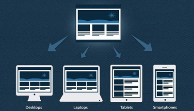
Responsive web design indicates a website that gives a smooth browsing experience to the user in mobiles or hand held devices as well, without demanding them to go through scroll, zoom, and pinch in or so to get a view of the website content. It is different from having a separate mobile friendly website where 2 different urls demand double maintenance efforts. Single content-single code combination in website development is what leads to an all device compatible website/responsive website.

Customers look for your company website on their mobiles and they would of course want to get the details in the easiest manner. Product information, contact details, search are some basics one needs to take care in design considering an appreciable small business growth without which most customers would leave the site!

Google’s SERP algorithm is complex; it considers more 100 factors to determine a web page ranking; Of this website responsiveness is one of the top most factors! Site bounce rate, customer reviews are all related to the mobile friendliness of the site and increased bounce rates directly contribute to lower rankings.

Video or image load on mobiles/tablets should be quickest possible because no customer likes to wait. Load time for every content above the fold has to be < 1 second as per Google’s expectations. Responsive websites are the best in providing a user friendly website in the context without which a business is sure to lose its mobile customers in due course.

More than 3-4th of the customers expects a mobile site to look better than a desktop site, simply because they like to do anything and everything on the move rather than having to wait for a laptop or a pc. Those businesses relying on the web traffic to achieve success are left with no option other than making the site responsive; make sure your company does it proactively in view of an excellent business growth!

Reaching more audience is possible only with the provision of a responsive site because more than 70% of the users browse on their phones, more than 40% of them do the purchase on phones, while a lot of them do a search and decision on the mobiles & complete the purchase on a desktop. When the customer buy decision happens in the mobile, then you well know how the website should look, on devices!

One website, one code maintenance is possible with the responsive sites while it may be tough to maintain a separate url for the mobile specific site.

Responsive sites are great for SEO because of the following reasons: Content duplication is avoided, no separate SEO effort needed for hand held devices, higher ranking on mobile search is assured, Google love is a responsive web design!

Increased conversions, a stay ahead in the competitive market, future preparation for the upcoming mobile technology, consistent design, great UX are all the benefits of responsive designs that should no more let you wait to do the design for your site. If you look for an expert assistance here or ecommerce service for the responsive web design, contact us now!

8 Biggest SEO Mistakes to avoid

8 Biggest SEO Mistakes to avoid

Growth from a SEO novice to an SEO pro isn’t quite easy and does take a few years; keeping in mind the rules of SEO are continuously getting modified. What are some common mistakes that you are prone to do and you should be avoiding?

  • Same strategies don’t work every time: Using the same method might just not work one fine time; this doesn’t mean we keep checking on it, but then it’s better we find something new. SEO is an investment that requires a constant update/change/monitoring and is not a one-time cost; if of course gives the best at the end of its perfect implementation. Keeping in pace with the growing digital system, investing in the right analytics and following the changing SERP guidelines is necessary!
  • Denial does help: Taking up the responsibility of faults is different but then when you know better on SEO guidelines and objectives on what needs to be fixed or what is okay as it is, ensuring a proper data analysis is carried out to investigate what’s broken is important!
  • Focused efforts needed: Just investing efforts in page ranking based on easy SEO keywords isn’t enough if you are targeting good revenue. The right amount of effort is required in choosing the right keywords that yield a bigger return. Not just that, grooming the social media profile, backlink, sharing option, images, product descriptions, security, the responsiveness of the site and all related matter!
  • Tweak the contract if needed: In view of giving the best services delivered to the customer, the SEO agreements mentioned in the contract may need to be overridden to get them fit the site needs. At the same time, it might be even required to work on certain aspects of SEO when it is not mentioned in the contract, if it is requested by the client. Be sure to accommodate!
  • Don’t wait to ask! If the SEO tactics implemented doesn’t yield the required results then it just means we are lacking somewhere. Sticking to same old concepts without having an idea of why it is failing is just foolish. If you don’t see your pages ranking in SEP page rank, don’t wait to ask for help!
  • Shortcuts are just okay: Over optimizing might lead to unnecessary penalties. Flooding the code with keywords, using illegal back links or any other attempt is carried out that is not genuine, it finally goes futile. Watch out!
  • Search engines see buying backlinks as a rule violation or spamming for an obvious reason; if search engines rank a site high and that site has useless back links and unrelated information, the search engine goes bad in views!
  • Make sure you don’t insert keywords just for the sake of search engines when they don’t really fit into the context. Long keywords very specific to the context yield conversions.
  • Tricking search engines just puts you in the trap. Don’t do it!
  • Don’t take the clients light: Securing current clients costs less and leads to getting new ones when you make the current ones happy. Preserve the existing clients; do the needful!
  • Don’t cease to learn: Search engine rules and SEO techniques are subject to continuous changes. Keep up to date in knowing them. Never stop to check upon them or to do the required learning!

Knowing the SEO tactics in website development/ web design for better web page speeds, using the right SEO keywords and SEO Description, content and image optimizing, using the right backlinks, using responsive web designs, you certainly require an expert help to get these implemented rightly. If you are looking for one, give us a shout!

Guidelines for using Responsive Web Desgin

Guidelines for using Responsive Web Desgin

Endless resolutions and devices necessitate the usability of a website on any device of any resolution at any point of time and obviously speaking each version is meant to be perfect in order to lose no visitors. An all device compatible website alone can be a solution to accommodate the situation in current day website development. Isn’t it? Responsive web design is doing the web development in such a way that the site responds to any user’s behaviour on a device of any screen, any size and any resolution/orientation.

A mix of grid layouts, images, smart use of CSS queries, automatic switch-ability based on resolution, accommodating images of any size and layout are some of the features a responsive website is meant to suffice and comes up with. It is not just about creating a mobile friendly website or a user friendly website but thinking differently for a new way of design.

To mention on adjusting the resolution of screens based on the device, in responsive web design, various size, colour, functionality and portrait/landscape layout should be thought of and incorporated. It’s not just about portrait/landscape but hundred other different screen sizes are to be taken up, grouped into major categories and make a flexible design of each; this might go tedious as the number of devices keep raising.

What can be done about it?

  • Flexible layouts: Enable automatic adjustment of images, non breaking lay outs, and designs that are flexible so that they get perfectly adapted when the devices move from portrait to landscape in a minute or when people switch from larger desktops to iPads or other tablets.
  • Use techniques for images: Image adjustments such as revealing them or hiding them as necessary, composite sliding image creation, creating the foreground images such that they scale well with the layout, dividing complex images into 2 as in one set as the background cropped and maintained while the other set such that it resizes proportionally.
  • Flexible images: When no other image styles interrupt, images load well provided the viewing width doesn’t become too narrow for the image width. But in reality when the height and width of the devices keep changing, the best is to have fluid images where the dimensions aren’t given in the code but left to be picked up dynamically based on the browser resize, using CSS for relative sizing. Take care of download times that shouldn’t become too long for bigger screens causing slower page loads.
  • Filament group’s responsive images: This technique shrinks the images on smaller devices not wasting space on the screen, in addition to resizing them. Consider this technique that’s supported in all modern browsers for websites with a lot of images, to save bandwidth and load time.
  • iPhone simulators: Web designs auto rescale to fit smaller screens in iOS, however this design resulted in images changing with the page even if they could fit into the screen that made other text scaled down. Take care of the viewport meta tag when using this.
  • Call a media query with CSS features max width, device width, orientation, color, screen, print, handheld for devices that support CSS3.

Hiding/showing the content, incorporating CSS3, using the right way of responsive web design, using different techniques to support touch screens and much more techniques exist in way of making the perfect ecommerce website to be given to today’s customers with their growing needs. If you are on a look out for a smart professional to do these for you, don’t hesitate to believe in us; and be sure you are getting the best always!

Is your website losing attention?

The website is a revelation of one’s business, brand, motive and customer reach. A visitor turning into a customer for the products and services you sell totally gets decided at the first time the site is visited. Homepage is the greetings which is either going to be successful in retaining the visitor or distract him towards other websites. When you come across the situation where you see the users aren’t sticking long to your website once they access the homepage, you’re sure you’re losing the traffic. Know why!

  • Clutter: Where the homepage is flooded with too much of information, the user doesn’t intend to check many of them and tends to go away.
  • Basic HTML designs: When businesses don’t want to employ someone demanding a good sum and goes ahead with basic html designs, it might sometimes end up in very basic design involving regular text on a basic interface which makes the user suspicious on the ability of the business to deliver complex services.
  • Language blunders: There are some basics which we can never miss to ignore whatsoever be the standard of the deliverables we give functionally. If the products and services you do are just too great but then the website has even a few errors in language basics as in grammar or spelling, it doesn’t give a good view of the business. Authenticity of you is shown here, don’t be careless!
  • Stock Images beyond limits: Only when in high end urgent situations like an article going live much earlier to the planned time or so, one can go ahead with the available photographs. Otherwise mediocre photographs never work.
  • Sound from auto playing flash or videos: Ads throwing their flash video widget content right on the users face or urls playing music at the background isn’t any pleasing to the people these days. They tend to miss the valuable service/product you provide. Regular Java and HTML in a simple interface works the best.
  • No contact details: Make it easy for users to reach out to you. Make sure to provide company’s email address and contact numbers. When it‘s just the mail address, it is quite annoying for some users to wait till the response is received even for simple tasks that take a min or two over the phone. Make sure to have an alluring Contact Us page.
  • Ads aren’t always exciting: Ads are ought to be given a thought as how important they are for the business revenue. Video ads in every page or a colourful banner in corners of the web pages might be your thought but be aware it distracts the users who find the interface too technical. Make sure to retain the average users before you try out these.

Having said these which aren’t any rules for you to stick onto but which have been identified as some of the major causes for declining number of users on a website, if you are looking out for the best web design service provider in web development to create the responsive web designs for your site or implement CMS like joomla to give a great design using images, CSS or so just ask us.

Will responsive web design help increase my product’s sales?

The revolution of mobiles today has resulted in a prediction that by 2018 the number of mobile connected devices would even exceed the world’s population. In this scenario, there isn’t any surprise as to why there’s so much of a stress upon having responsive Websites in web development for an estore or an ecommerce platform.

Responsive websites not just give a great experience to the users but save the time and revenue of the businesses that needn’t have to build separate sites for pcs and mobiles. They add a value to the SEO campaigns due to the simplicity of a single url in place. Above all, Google’s love is the business necessity. Isn’t it? Responsive web designs are one among!

To talk on some figures how responsive websites add to conversion rates, there’s a firm that gives us the data 3 weeks after switching onto the responsive design,

  • Conversions soar by 65.7%, transactions by 112.5%, and revenue by 101.25% for iOS devices
  • Conversions soar by 407.32%, transactions by 333.33%, and revenue by 101.25% for iOS devices

To mention on why responsive websites have created this impact, there are quite a few yet worthy standpoints.

  • User experience: Content sharing is the core of communication between the business and the user via the websites. Responsive websites achieve this at the best. Browsing across multiple devices gives the same great experience as in one device or in a desktop, with responsive sites; no pinching, no zooming, no struggling. Bounce rates might decrease when people find the same content in 2 different views. But then a functional and accessible alternative on any device they use, impresses them to stick onto the website.
  • Audience reach: More than 50% of the population owns a smart phone in united states. What is being used them in the phone is important to understand what can give way to better conversions. Most people (67%) most of the times staring at the mobile for calls or texts even though there isn’t any vibration or tone simply makes it clear of their addiction to the devices. Isn’t this telling you why your website should be mobile friendly, as good as it is on a pc?
  • Good clarity in mails: Talking about emails, KISSmetrics conveys that 90% of the people tend to immediately delete an email if they get to see it in their mobiles, from a business website they aren’t bothered of. The reason for this is the clarity of the mails in a hand held device, click rates thus go down as compared to that in a laptop. Clarity along with good landing page experience for users is absolutely necessary if you wish to grab a million minds. An unappealing landing page leads to lower conversion rates for sure.

If you have woken up for the responsive design trend that’s necessary for every e-commerce platform that tends to cause a big effect on people, and if looking out for the best service provider to implement responsive websites, wordpress, joomla, psd, CMS, drupal or any for sales and business growth, just ask us. We assure you just the best.

Is your non-mobile friendly website the reason behind loss?

It isn’t any surprise to know we are close to the time where most users get to use the internet for the first time in mobiles! No wonder if there comes an age when PCs will just be used for huge researches or white paper preparations or so and all the rest as in shopping, banking, recharge and all around are 100% used in mobiles; Having said this, and knowing that the top most search engines Google and Bing rank responsive websites in top of their SERPs, the business has nothing to do other than grabbing this situation to create more and more opportunities in responsive web designs to survive & flourish.

To jot down distinct evidences of why one should have mobile friendly website with the good flash make up and page speed for the business growth,

  • Smart phones are too good for hand held browsing as they are easy to carry and there are loads of internet service providers with various exciting offers to give the mobile internet at good affordable rates. When a website looks unclear or requires a zoom in and out to read the contents on a mobile, it’s quite obvious the user gets annoyed and pushes him out of it. Wake up! Have responsive websites!
  • Mobile internet and its affordability, as mentioned above, have resulted in 60% of the internet users sitting over it in mobiles rather than desktops.
  • Google maps are something we now use whenever we go out to a place we aren’t sure to direct ourselves. With people searching for you and your business location for their nearby services or outlets, it’s quite straight forward you go to doom when you don’t own a mobile site.
  • Today’s trend in shopping is surprising to the level that people while inside the physical shop still order online and collect from the store to avoid long queues or to avail mobile specific discounts or to ease their item search or for various other reasons. When such a customer finds you in the web and goes out to your mobile app, just imagine the situation where your app isn’t user friendly? The user just walks out to another app that’s responsive to their needs. Wake up!
  • Google’s mobile friendly algorithm update made in April 2015 clearly tells why mobile friendly websites are considered top most in providing the greatest user experience, in SEO and hence in the rankings.
  • Having different mobile apps to accommodate different platforms isn’t a great idea at all simply because fighting among the 10000 competitor apps is a big challenge and we don’t want to put ourselves into a bigger challenge having to fight for not just one but 3-4 or more in the crowd. Responsive websites solve it all.
  • With the rise of smart handsets, headphones, internet technologies like 3G/4G, wifi, giving an outstanding user experience is a meagre standpoint every business has to achieve. A good mobile website is ensured to attract the customers and to use you for their needs where you grow the customer base!
  • A single responsive website is more cost effective in comparison to having one site each for the desktop and mobiles. Along with the man-made resources for support and maintenance, we are forced to allocate man resources as well to keep the sites up-to the mark. With the least number of resources, give the best, use responsive websites!
  • Social media being used on mobiles much higher than they are on desktops, there is a higher chance of accessing the mobile app from a link in the media site and hence in hand held devices.

If you are looking out for the best service provider to set up a mobile friendly website or conversion from a non-responsive site to a responsive one, for your business at an affordable rate, feel free to get in touch with us.

Lessons for your Restaurant’s Website!

Yummy foods need to look yummy in the web otherwise they will never be known yummy. It isn’t just a rhyme but it is highly important restaurant website and food websites project the foods in an excellent looks in the web be it in desktop url or in the mobile site. What all to care upon in a hotel web design? Ride along,

  • Photography is the soul!

This isn’t any hyperbole. To sell even a shampoo or a tooth paste, a retailer puts in efforts to make the product look bright and just too nice to grab the customer attention and then comes the subsequent pay based on the real quality. Just imagine how amusing the food has to look then to get the mouth water out of the people?! Poor photography does more loss than the poor food for the first time prospects as they would never be turned to customers. Exhilarating photos could earn more bucks or not is a question ‘two’ but bad photos are never going to, in first place

  • Atmosphere matters, for no one likes to sit in a dirty place to eat!

Visuals for a restaurant website should consider not just the foods but the building ambience and the physics of the place as well. Having great foods in a great place is what we look for. Isn’t it? Not just an excellent food in a stinking atmosphere.

  • Dress code for the hotel staffs should be professional and amicable!

How the people, who serve, look really matters in customers getting drawn to the place. No one likes to get served from someone who doesn’t look presentable, quite obviously! Having a great dress code, neat and professional for the hotel staff is very important

  • Texture and colours if dull, then is it going to be liked by you? Just ask yourself!

Texture is a wonderful magic quite available in your own disposal as a restaurant owner. The home page with various awesome textures in back ground and as well in the actual photos is the niche of top designers. Colours set the moods of people and enhance the hunger or even create it completely! Bright colours are a great choice; don’t be hesitant to play with them ‘sensibly’!

  • Break down ingredients makes a mark too!

Showing fresh fruits or fresh veggies or sauces in their half cooked form or desserts while in the process of completion entices the people because they know you use real stuffs to get the quality foods.

  • Custom menus for desktop and mobile is important!

Food menu used for desktops shouldn’t be used for mobile sites for the simple reason no one likes to pinch, zoom and read but loves to see the texts just handy to read as such.

  • Basics should go in!
  • What is served in the appropriate menu and graphics
  • What is served in the appropriate menu and graphics
  • Cost for the items
  • Graphical representation of the place to show the ambience
  • Whereabouts of the place
  • Ability to make reservations online
  • Contact number

Knowing the basics of web designs, tactics for Responsive Websites, about why responsive web design important, how mobile friendly website contribute to benefit business growth and increase business revenue, what are the nuances in designing restaurant website for a greater business growth and more, we ensure to give you the best for your restaurant website in mobile or web. Just ask us here.